Cultural website, review of the week #003: M+
Some thoughts about the website for Hong Kong’s global museum of visual culture
Review of the week
Each week I’ll share an example cultural website, and some quick thoughts about what I reckon it does well, and less well, with a focus on a handful of key pages.
I’ll post screenshots of the pages I’m talking about. Although that is not really a very good way to showcase websites, so I’d recommend you go to each actual site and experience it for yourself.
I’ll also stick a poll at the end of each article, because polls are fun.
I have not been involved in the designing or building of any of these sites, so this is just my opinion as someone who spends (a lot of) time on these things both in my work and personal life. Equally this is not an ‘audit’, it’s just a collection of some first impressions.
M plus
M+ is a new museum that opened in November 2021 as part of the West Kowloon Cultural District of Hong Kong.
When it opened, ARTnews said “it could very well become one of the most important contemporary art institutions in Asia”.
It’s been interesting to observe how the various parts of the West Kowloon Cultural District have come online as the development has evolved over the past 10 years.
The project has an enormous amount of money at its disposal, yet many of the organisational websites that have been launched have been underwhelming or strange, to say the least.
So I was intrigued to see how the museum of visual culture decided to represent itself.
What I like:
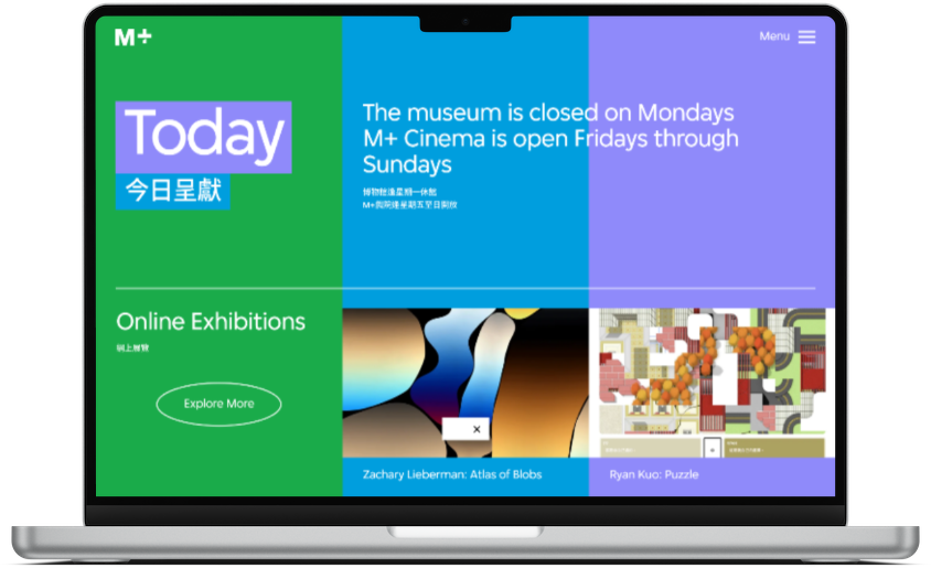
Design and Colour!
Museum and gallery websites for organisations based in Europe and North America tend to look very similar, and I really like that from the moment you land on this site it looks and feels quite different, interesting, and vibrant.
Although of course a degree of familiarity is sensible, Jakob’s Law states that “Users spend most of their time on other sites. This means that users prefer your site to work the same way as all the other sites they already know”.
But I find it really frustrating that so many cultural organisations end up with institutional websites that look almost indistinguishable from one another.
There is rarely a real sense of institutional personality achieved through the design, and I really enjoy the bold use of colour throughout the M+ site, it’s fun, it’s engaging, it works.
The use of colour also means that the site is less reliant on ‘hero’ images for impact, which is a sensible approach.
Too often we see nicely designed sites only looking their best when there are the ‘perfect conditions’ present around content.
You’re not always going to be able to rely on having perfect content, so this sort of decision is a sensible mitigation strategy to keep the site looking consistent and strong.
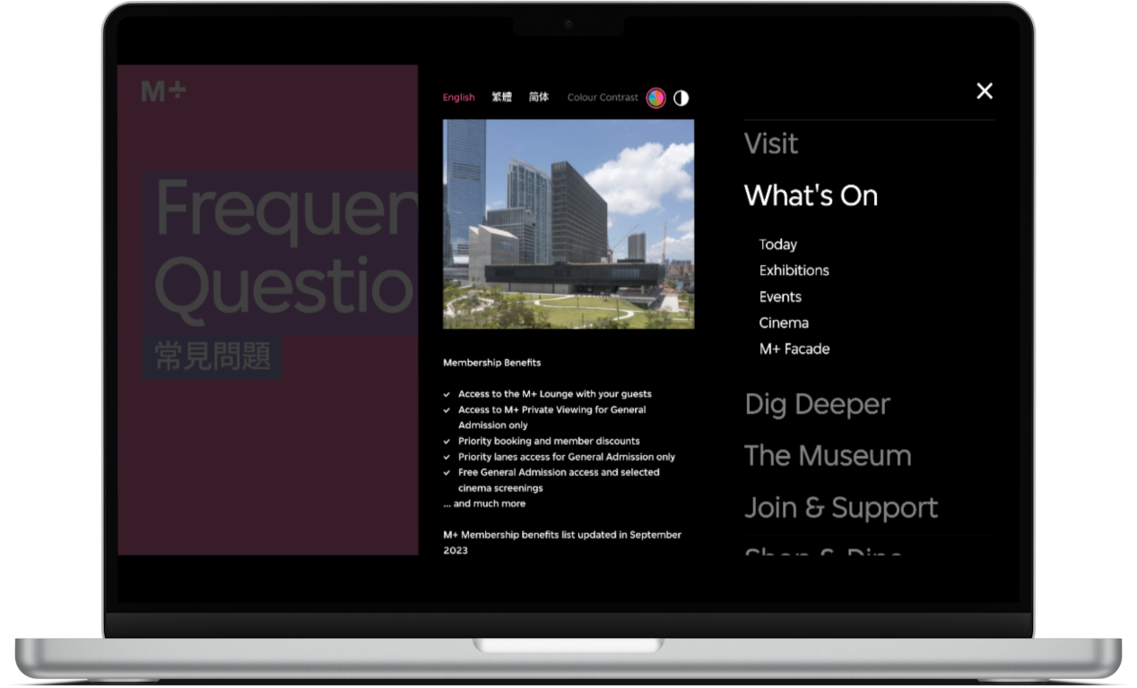
And for those who find the colour too much, or have colourblindness, there is the option (available in the main menu) to switch the site into black and white/high contrast mode.
Article content design
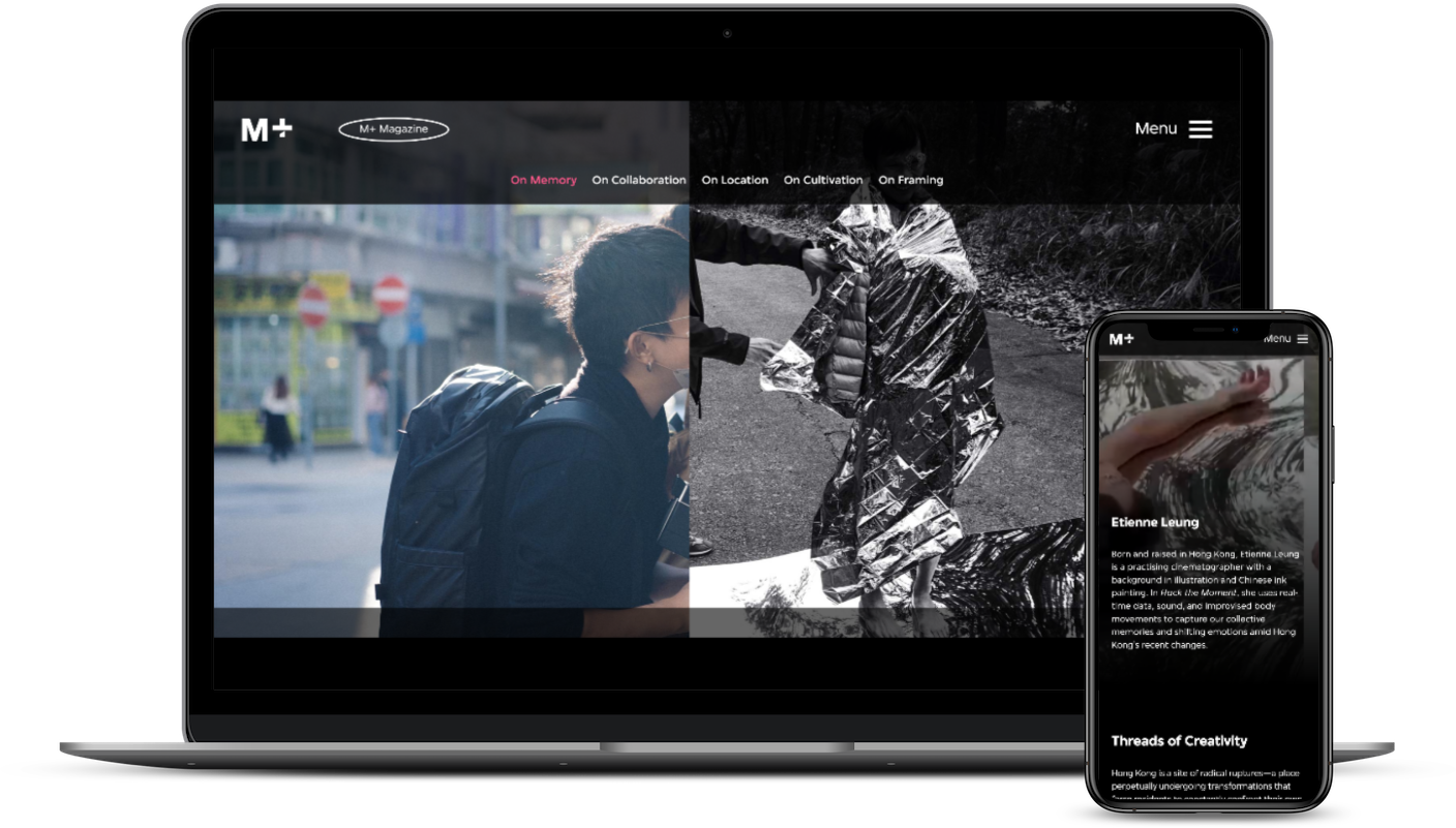
There is a lot of long-form content available in the “M+ Magazine” section of the site.
This section does a fairly good job of feeling genuinely ‘magazine-like’, and some of the long-form article content is laid out really nicely. Perhaps taking influence from some of the digital storytelling approaches that places like the New York Times have adopted over recent years (here’s an example of that).
This type of page design is especially difficult to portray in screenshots so go and check it out yourself.
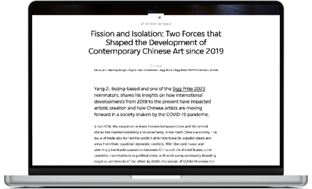
It’s not perfect - I don’t think the way the text is presented is alwayscompletely successful if you want someone to spend time reading it.
But this approach presents mixed-media content in a pretty engaging and beautiful way with lots of transitions between content sections based on scroll behaviour in a way that doesn’t feel annoying or flashy for the sake of it.
They haven’t taken this approach to every article, and when there isn’t the content available they take a more restrained, simple approach which I think works really nicely (and solves the text-legibility problem I mentioned above).
You’d think this sort of simple article layout would be an easy thing to get right, but it is so rarely done successfully.
Sensible nav choices
I’m a bit obsessed with how sites are structured, and how navigation menus are put together. I’m particularly interested in the priorities and language choices that people make.
So I like the fact that:
- the M+ main nav has a relatively restrained number of options,
- these options are named sensibly,
- the sub-nav options reflect likely user priorities (e.g. by ‘today’ being the top option within ‘what’s on’).
What I’m less keen on:
The scrolling navigation menu!
Having said I’m a fan of the nav options above (and I am), I also want to say that the choice to make the menu a giant long, scrollable list of membership benefits, newsletter subscription, and social media icons is…silly.
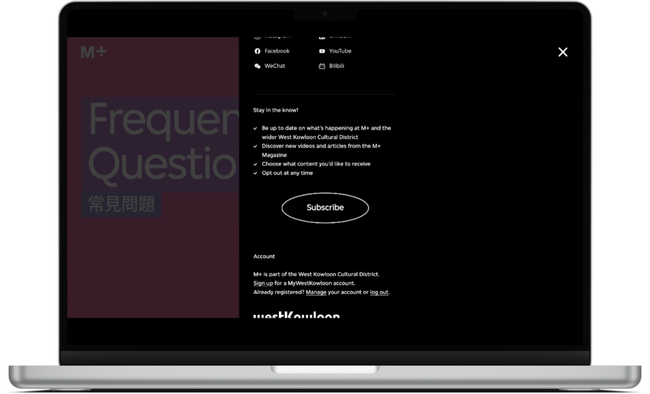
After the restrained success of the main nav options the rest of this section of the user interface is a mess.
It lists out all membership benefits (a version of this idea could’ve been successful) and a call-to-action button to ‘become a member’, then it lists out all of the museum’s social media accounts, then it lists out some benefits of subscribing to the newsletter (and a subscribe button), then there is some account-related stuff, a funder logo, and some text links off to other areas of the site.
Now there is a world in which all of these things could’ve been presented in a way that didn’t feel overwhelming.
But the design choice to make the menu only occupy 2/3rds of the screen, and for the main navigation options to take up half of that menu’s width, means that all of this stuff ends up being squashed into a long, narrow space.
It’s a misstep that feels even more noticeably because of just how well designed the rest of the site is.
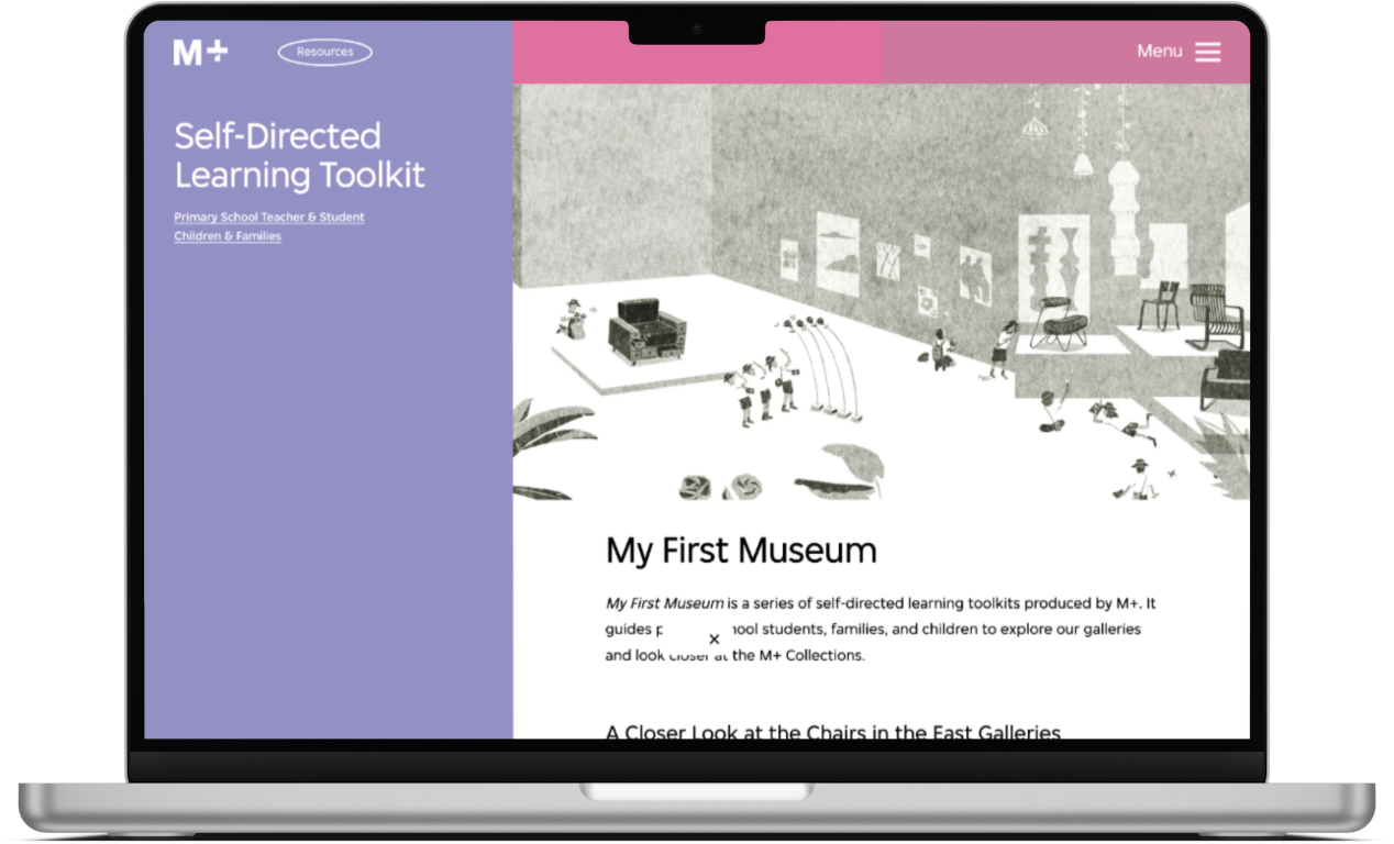
Education resource pages
After I got so excited about the brilliant Schools Hub pages on the National Portrait Gallery site it’s a bit sad to see how underwhelming the equivalent pages are on the M+ site.
The ‘my first museum’ resource is a particularly uninspiring example.
The text content is dull, the imagery moreso. I’m not really sure how this is going to get anyone, parent, teacher, or student, excited about their first museum visit.
Buttons and links
This is probably just a me thing, but I really don’t like the trend we’ve seen over the past 5 years or so for these oval, outline button designs.
I think they’re ignorable, and for people who don’t spend a lot of time on the types of websites that use this design pattern (usually agency sites, things related to web3, tech startups, etc) I don’t think you’d necessarily know that it is a clickable element.
It is one of very few places where the site feels like it’s trying a bit too hard to be cool for the sake of it.
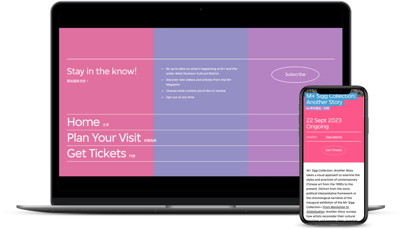
I also think the decision throughout the site to not visually differentiate linking text is a mistake.
The site uses white text everywhere, links are no different. There is an ‘on hover’ interaction that adds an underline on desktop, but on mobile there’s nothing. There are a couple of places (e.g. gallery/venue names) where the link text is consistently differentiated (with a permanent underline) but this doesn’t exist across all linking text.
Again this feels like a mistake where design consistency has overriden usability.
In the screenshot below ‘M+ Sigg Collection: Another Story” is linkable, but not obviously so
This may seem like a small thing, but the site gets so many other small things right that this is a miss.
Overall
I think this site is (mostly) really, really well designed. It’s not flashy, or showy. But it is interesting, engaging, and it has personality. It showcases some quite tricky content formats in a really elegant way.
The quality of the design was present in almost every part of the site I explored.
However that nav menu design is ridiculous.
I think there are some interesting ideas for cultural organisations to think about here.
- The site feels different. They have not just copied their nearest direct equivalent organisation. But they have done so in a way that still feels usable and engaging, rather than confusing.
- They have paid real attention to how their engagement-focused content is presented and how all the pages are designed. This attention means that the site feels like a high-quality, interesting, engaging experience almost regardless of where you enter it. E.g. social activity may mean folks land on the long-form content pages, search activity may mean people land on information-focused pages etc. Most people won’t be entering the site through the homepage.
What do you think of the M+ site? My opinion is just that, one opinion, I’m intrigued to hear yours.
Vote in the poll or leave your thoughts in the comments.