
Each week I’ll share an example cultural website, and some quick thoughts about what I reckon it does well, and less well, with a focus on a handful of key pages.
I’ll post screenshots of the pages I’m talking about. Although that is not really a very good way to showcase websites, so I’d recommend you go to each actual site and experience it for yourself.
I’ll also stick a poll at the end of each article, because polls are fun.
I have not been involved in the designing or building of any of these sites, so this is just my opinion as someone who spends (a lot of) time on these things both in my work and personal life. Equally this is not an ‘audit’, it’s just a collection of some first impressions.
Prosanova Festival 2023
“Since 2005, this largest and most well-known nationwide event for young contemporary German-language literature has taken place every three years in Hildesheim. More than forty contemporary authors are invited to stage, celebrate, doubt, make visible and, at the same time, experience their writing, their texts and literary methods in Hildesheim.”
This is a bit of a Christmas novelty really.
My colleague, Paddy, often finds unusual examples of web design, and this is certainly that.
I quite like it when I encounter a website that feels so strange and jarring, it’s good to be surprised, but is this website good?
What I like
Playful homepage
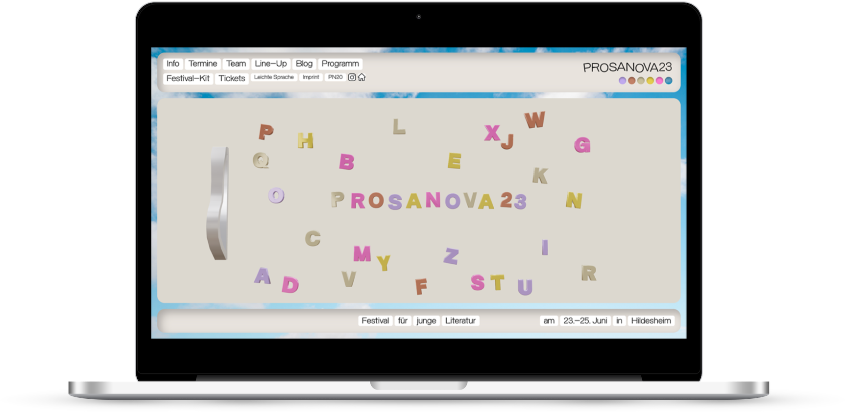
For reasons that aren’t entirely clear to me there is a sort of ‘fridge magnet’ interface that you can interact with and reorder.
It’s completely inexplicable, but it’s quite fun.
I’m often struck by just how dour and serious most cultural organisation websites are so it’s nice to see something so playful.
The pointer icon is a hand which ‘grabs’ when you click on something. It’s strange (and a bit pointless), but it’s different (and a bit playful).
What I’m less keen on
Unusual (in my opinion, bad) UX, and UI design
I regularly talk about how websites feel to use.
And this site feels baffling. Like a strange trip back in time to the late 90s.
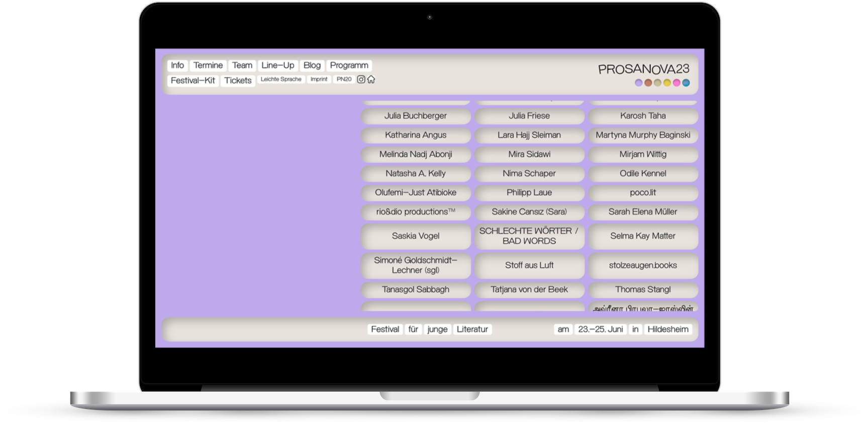
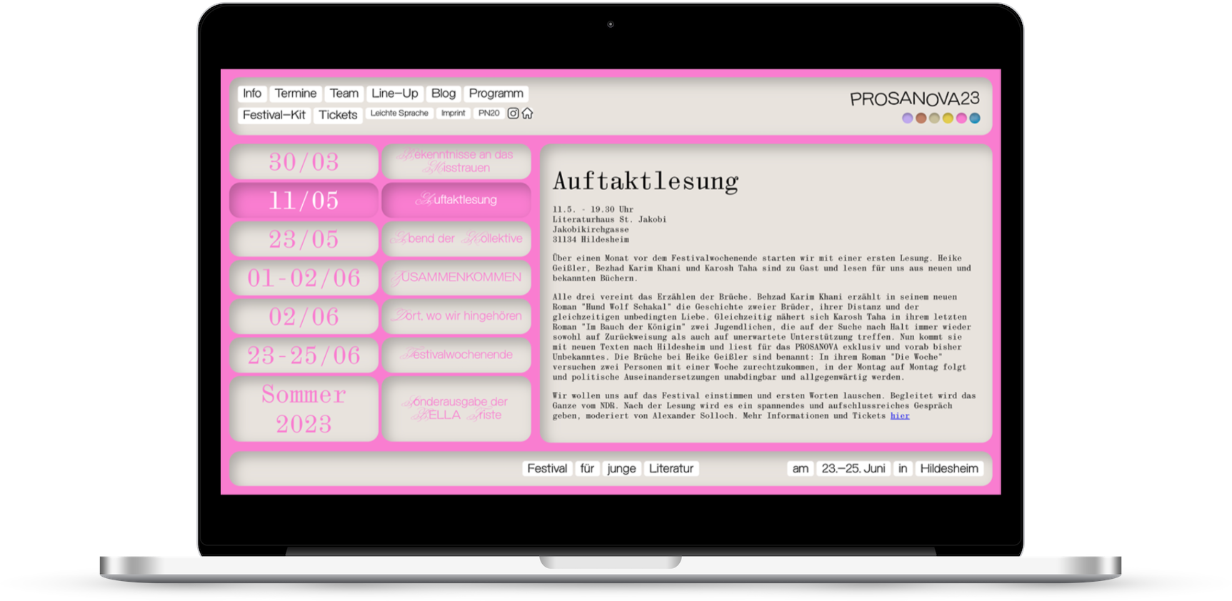
Text blocks that expand inline, it’s unclear what is and isn’t a button, I’m not entirely sure which bits are nav and which bits are decorative, the whole thing is locked in place between a fixed header and footer, and has endless scrolling elements within that.
It’d slightly more usable on mobile than it is on desktop but that’s not saying much.
I can’t work out how intentional any of this, are they in on the joke, or is this a swing and a miss attempt at something cool?
Content design
In my (limited) experience, German websites seem to really like lots and lots of text.
And this site certainly embraces that trend.
Lots and lots of text is not necessarily a bad thing. But it is when it’s just presented a big, overwhelming block that’s just dumped on the page.
Also one of the navigation items links to a pdf, which is a weird and bad thing to do.
Tl;dr
This site must be trying to raise a smile, it feels intentionally silly.
Happy Christmas.
What do you think of the Prosanova 23 site? My opinion is just that, one opinion, I’m intrigued to hear yours.
Vote in the poll or leave your thoughts in the comments.