Cultural website, review of the week #006: The Shed
Some thoughts on the website for New York's $475 million arts centre

Review of the week
Each week I’ll share an example cultural website, and some quick thoughts about what I reckon it does well, and less well, with a focus on a handful of key pages.
I’ll post screenshots of the pages I’m talking about. Although that is not really a very good way to showcase websites, so I’d recommend you go to each actual site and experience it for yourself.
I’ll also stick a poll at the end of each article, because polls are fun.
I have not been involved in the designing or building of any of these sites, so this is just my opinion as someone who spends (a lot of) time on these things both in my work and personal life. Equally this is not an ‘audit’, it’s just a collection of some first impressions.
Welcome to The Shed
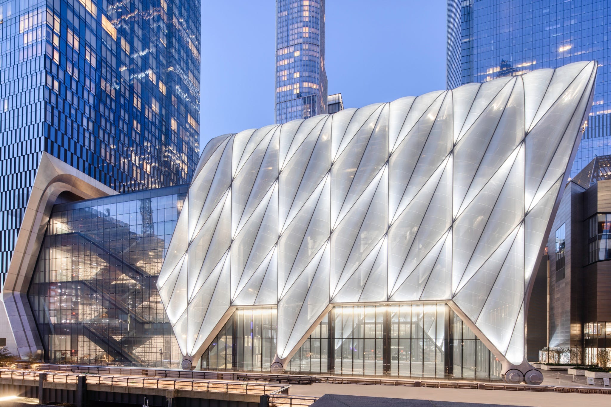
I couldn’t find a particularly succinct explanation on The Shed’s website about what it actually was so here’s Wikipedia:
“The Shed (formerly known as Culture Shed and Hudson Yards Cultural Shed) is a cultural center in Hudson Yards, Manhattan, New York City. Opened on April 5, 2019, the Shed commissions, produces, and presents a wide range of activities in performing arts, visual arts, and pop culture.”
When it first launched, The Shed’s website was often cited in client conversations either as a site that they loved or that they violently disliked, so it seemed like a good candidate for review.
What I like
Homepage video
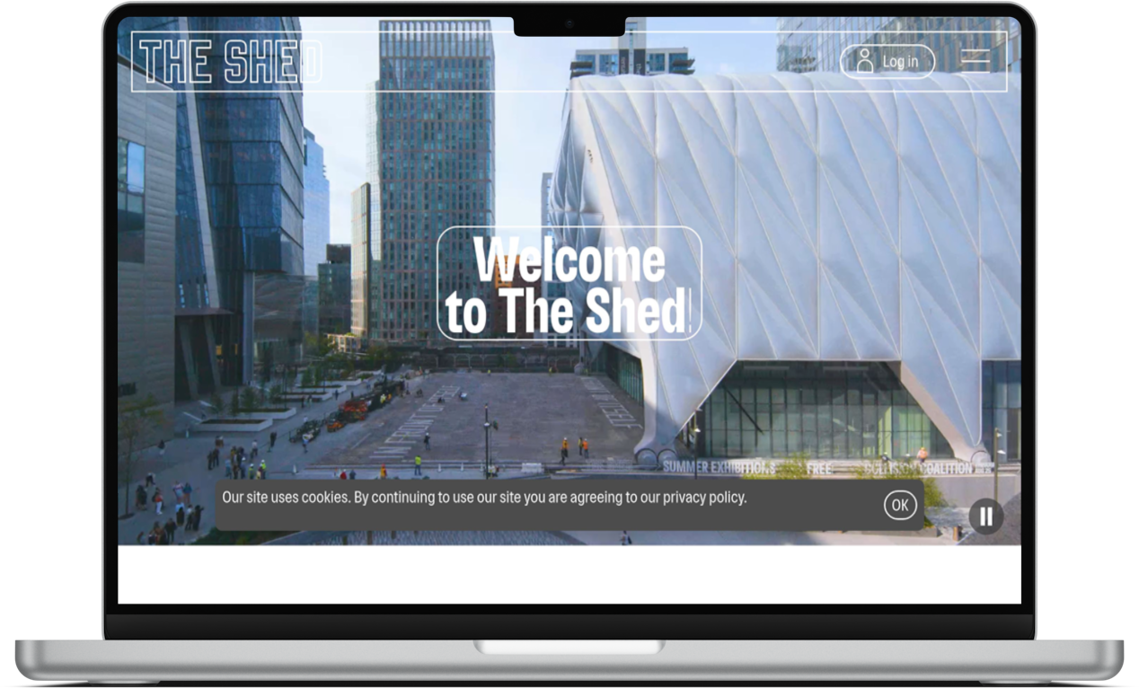
The hero video on the homepage makes The Shed look vibrant and exciting, and a bit strange. It looks like somewhere that I’d want to visit.
The video does a good job of capturing what looks to be an incredibly diverse programme.
It’s a nice example of ‘show don’t tell’.
You don’t need to listen to any boring talking heads to understand what you’re seeing.
Thinking differently
For many elements of the site the team at The Shed have clearly tried to think differently.
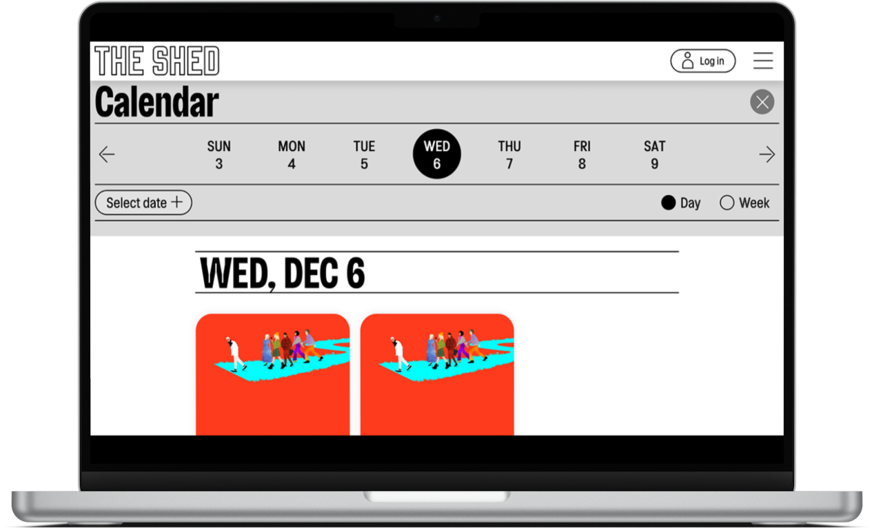
From the design (more on that below), and the way that the event programme is presented, to the ‘at The Shed?’ functionality accessed via the nav (which entirely changes the content focus and IA of the site to, presumably, foreground the priorities of physical on-site visitors), there is a lot of new and different thinking underpinning the site.
This is interesting to see as so often the starting point for decisions about cultural websites seems to be other cultural websites.
What I’m less keen on
The design
I know this is subjective, and I have had people tell me that they think the site’s design is ‘exciting and compelling and makes me want to visit’.
But, it’s a very particular style of design which grew out of web design trends in the late 2010s.
You see some echoes of it in some of the design elements on the M+ site (that I reviewed a few weeks ago here).
And I don’t like it.
The most obvious elements are the rounded, outline buttons (and other UI elements). And very large typography.
Personally I find it very overwhelming and difficult to engage with, particularly on smaller screens. And elements such as the outlined buttons and navigation UI are difficult to make out when they are deployed with an image or video behind them.
I also think that the design approach on the site has made the site feel jarringly put together.
This is perhaps intentional, but it makes the experience of navigating the site feel very ‘noisy’ and perhaps even slightly obnoxious.
It isn’t a site that feels like it’s helping you get to where you need to be.
Overall, in my opinion, the site’s design feels like something that probably looked great as flat mockups but simply doesn’t work as an experience that users are interacting with.
The way that this design approach has been deployed on the Shed site proactively breaks a few well-established ‘laws’ of user experience. Mostly related to how users scan and consume content, which further exacerbates this feeling of hostility.
The approach to show content
If you look at the pages for King Lear, or Here We Are, there is nothing really there the describes what the show actually is.
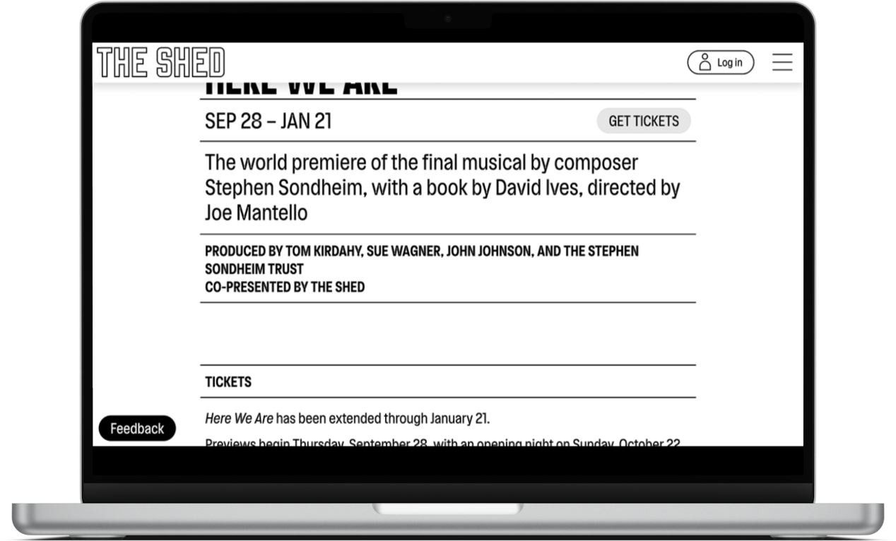
There is a blizzard of creative team and performer names, and sponsor recognition, but nothing that would really help an audience member understand whether or not this was for them.
Perhaps that isn’t important to The Shed, but it feels like another example of the site not really having the needs of its audience at the forefront.
This doesn’t only happen with show content, it occurs throughout the site. The show pages are just the most jarring example (fwiw the homepage is mostly pretty good, the rest of the site, not so much).
Overall
It feels like the site is stuck between trying some really new, different and bold ideas, and having to take an incredibly internally-focused and conservative approach to much of the content.
I think the missing element is any real user focus.
It feels like the audience this site is trying to satisfy is mostly internal.
What do you think of the The Shed’s site? My opinion is just that, one opinion, I’m intrigued to hear yours.
Vote in the poll or leave your thoughts in the comments.