Cultural website, review of the week #001: National Portrait Gallery
The first in a new series, some thoughts on what the new NPG site does well, and less well.
I was reading this post from Hugh Wallace where he mentions how he used to tweet a “museum website du jour” each day.
I remember Hugh doing this, and found it a good way to broaden my horizons of what was going on in the sector around institutional websites.
So I am going to unashamedly steal Hugh’s (old) idea, and do it less frequently, and probably not as well.
Review of the week
Each week I’ll share an example cultural website, and some quick thoughts about what I reckon it does well, and less well, with a focus on a handful of key pages.
I’ll post screenshots of the pages I’m talking about. Although that is not really a very good way to showcase websites, so I’d recommend you go to each actual site and experience it for yourself.
I’ll also stick a poll at the end of each article, because polls are fun.
I have not been involved in the designing or building of any of these sites, so this is just my opinion as someone who spends (a lot of) time on these things both in my work and personal life. Equally this is not an ‘audit’, it’s just a collection of some first impressions.
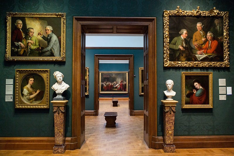
First up, the National Portrait Gallery.
The new National Portrait Gallery
I chose the NPG as it has recently reopened after a capital redevelopment project, announced a rebrand, and launched a new website.
So it felt like a good place to start.
What I like:
- Clean, clear navigation. There’s no burger menu hiding a mess of confusing secondary navigation and the options that are presented seem relatively constrained, and driven by likely user priorities.
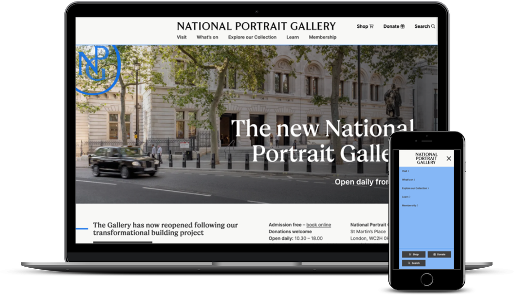
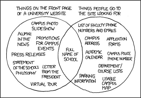
- The fact it tells you what time they open, on the homepage (usually one of the top things we hear users want to immediately see), that admission is free, and the address is front and centre. This isn’t sexy information but it is what people are looking for (could maybe be improved by having this more consistently across the site as I’d expect most people aren’t arriving on the site via the homepage).
Which reminds of of this old xkcd.
Anyway, back to what I like:
- On the whole, the way the pages are laid out. Cognitive overload is often something that cultural websites are quite bad at acknowleding in any meaningful way. Most of the NPG landing pages do a good job of presenting a limited number of well-considered things to the user at any one time.
- The fact the Schools’ Hub pages exist! On many (most) other sites these pages wouldn’t be standalone pages, they’d be pdfs. The fact that these resources exist as navigable, accessible webpages is a small triumph.
A couple more things I like (/love) on the School’s Hub pages (taking this page on Queen Elizabeth I by Marcus Gheeraerts the Younger as an example)
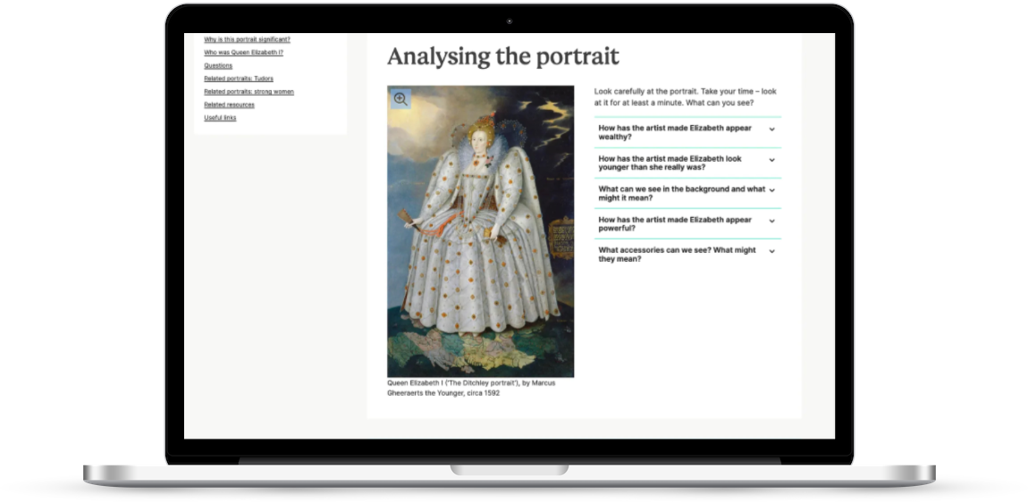
- The ‘helper’ highlights on jargon or less commonly used words. On words like ‘Tudor’ and ‘commissioned’ and ‘colonised’ there is a tooltip that you can click to get a plain English explanation of the term. This is great! Every cultural organisation should do this! And the NPG should expand this out across every page on the site! It’s not just an ‘education resources’ thing it’s a ‘more people will understand more of what you’re saying if you do this’ thing (I’ve written before about how cultural organisations need to write more clearly: ‘focusing on readability is not dumbing down’).
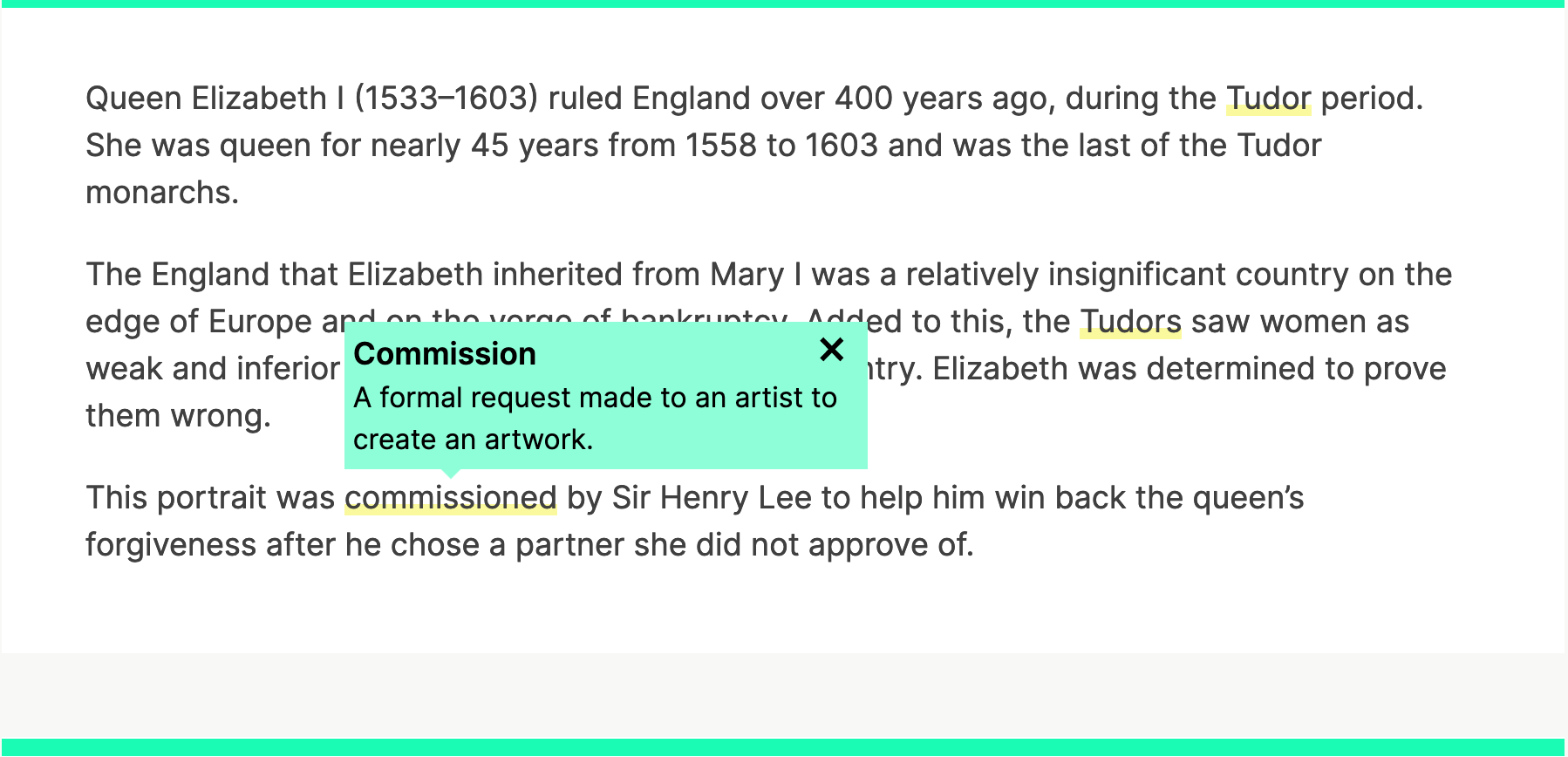
- Plain English. The tone of these learning-focused pages is clear, comprehensible, and informative, this is further enhanced by the ‘helper’ device I mentioned above.
What I’m less keen on:
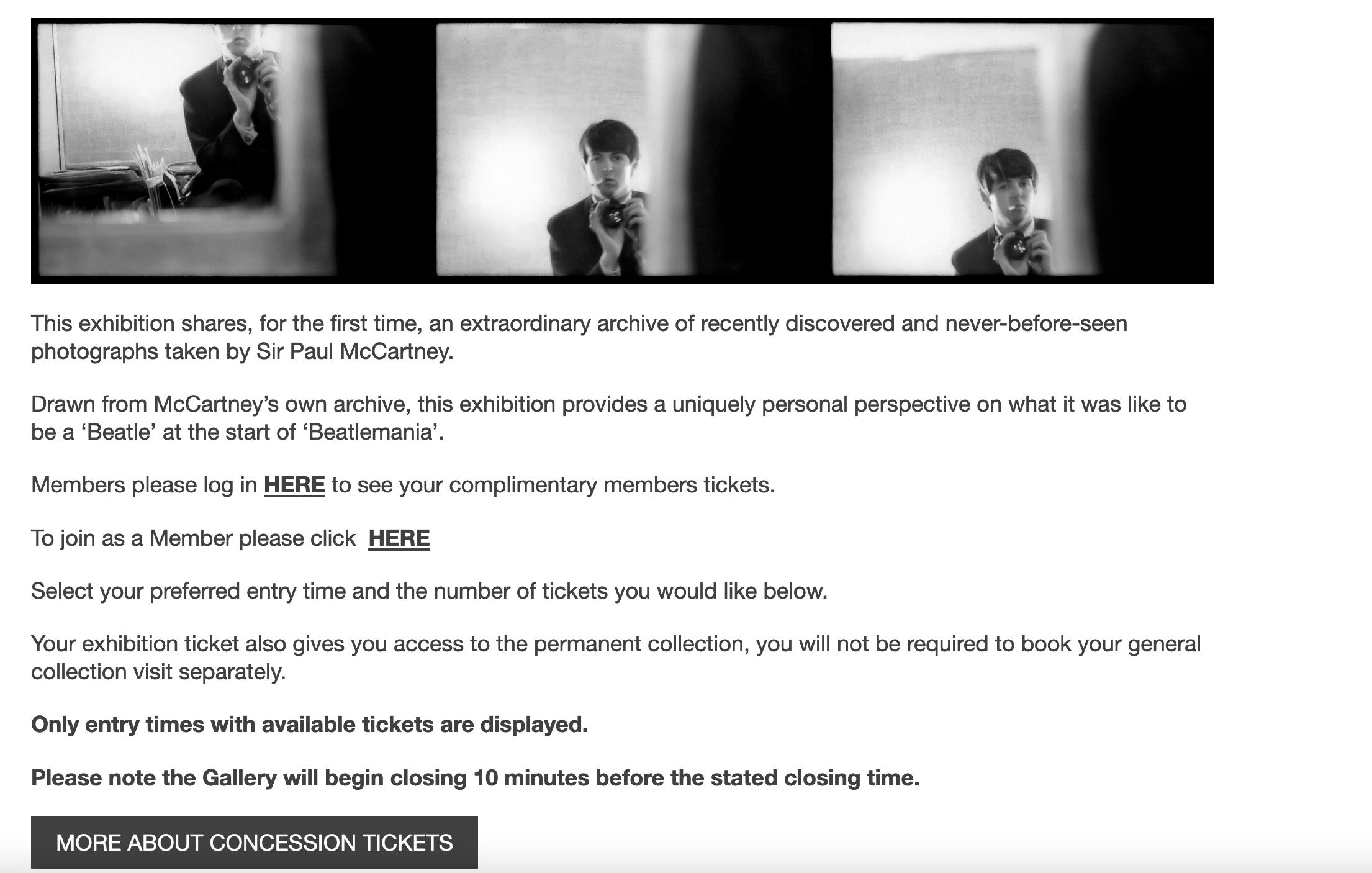
- The (big) missed opportunity to upsell memberships on exhibition pages! They’ve identified that free entry is a compelling benefit of membership, and they’ve communicated that clearly right at the top of every exhibition page. But they are not making much effort to use that clear and compelling reason to actively sell memberships. There is no (easy) way for someone to react to seeing that big compelling reason and buy a membership. There’s a sort of half-hearted attempt to upsell memberships in the booking pathway, but that is done in such an ineffective way that I’d expect most people glide past without even registering it (screenshot below, let’s not even get started on all the ‘here’ links…)
- I think they’ve done a bit of an underwhelming job on the exhibition pages altogether, especially given how competent the rest of the site is. There’s little or no compelling content and the commercial focus of the pages is very weak (there is a good/large range of related items available in the shop for most of the exhibitions yet the exhibition pages mention none of them specifically, apart from the exhibition book, and just links off to the shop in a ignorable/underwhelming way, and membership sales…well, more about that above). Given it’s such an outlier there must be a good reason for why these pages are so strangely put together.
Overall
I think this site is much better than the site it replaced (which was incredibly dated and difficult to use).
Overall the new site is clean, clear and full of (mostly) sensible choices. This shouldn’t be underestimated, especially as this site came out of a period of significant renewal (a big building project and rebrand) which would probably have resulted in a significant amount of…shall we say, stakeholder and expectation management.
Some of the content in the School’s Hub is genuinely brilliant but there are some weird missteps on what you assume are some of the highest traffic pages on the site (i.e. temporary exhibition pages).
I don’t get a clear sense of institutional personality and it could be argued that the design of the site is a little restrained and uninspired, but equally they may still be getting to grips with their new brand.
Next week, the Berliner Philharmonkier.
What do you think of the National Portrait Gallery site? My opinion is just that, one opinion, I’m intrigued to hear yours.
Vote in the poll or leave your thoughts in the comments.