Cultural website, review of the week: #009 Stedelijk Museum Amsterdam
Some thoughts on the website for Amsterdam's museum for modern and contemporary art and design

Each week I’ll share an example cultural website, and some quick thoughts about what I reckon it does well, and less well, with a focus on a handful of key pages.
I’ll post screenshots of the pages I’m talking about. Although that is not really a very good way to showcase websites, so I’d recommend you go to each actual site and experience it for yourself.
I’ll also stick a poll at the end of each article, because polls are fun.
I have not been involved in the designing or building of any of these sites, so this is just my opinion as someone who spends (a lot of) time on these things both in my work and personal life. Equally this is not an ‘audit’, it’s just a collection of some first impressions.
Stedelijk Museum Amsterdam
The Stedelijk is the (self-proclaimed) “must-see museum for modern and contemporary art and design in Amsterdam”.
I’ll start this by saying, I love the Stedelijk.
The couple of times I’ve been there have been some of my favourite museum visits.
I couldn’t really tell you why, the exhibitions were superb but overall the place just had a really nice vibe.
Anyway how does its website stack up?
Caveat, as ever with non-English language sites, I am reacting to the English-language version which may differ significantly from the native-language experience.
What I like
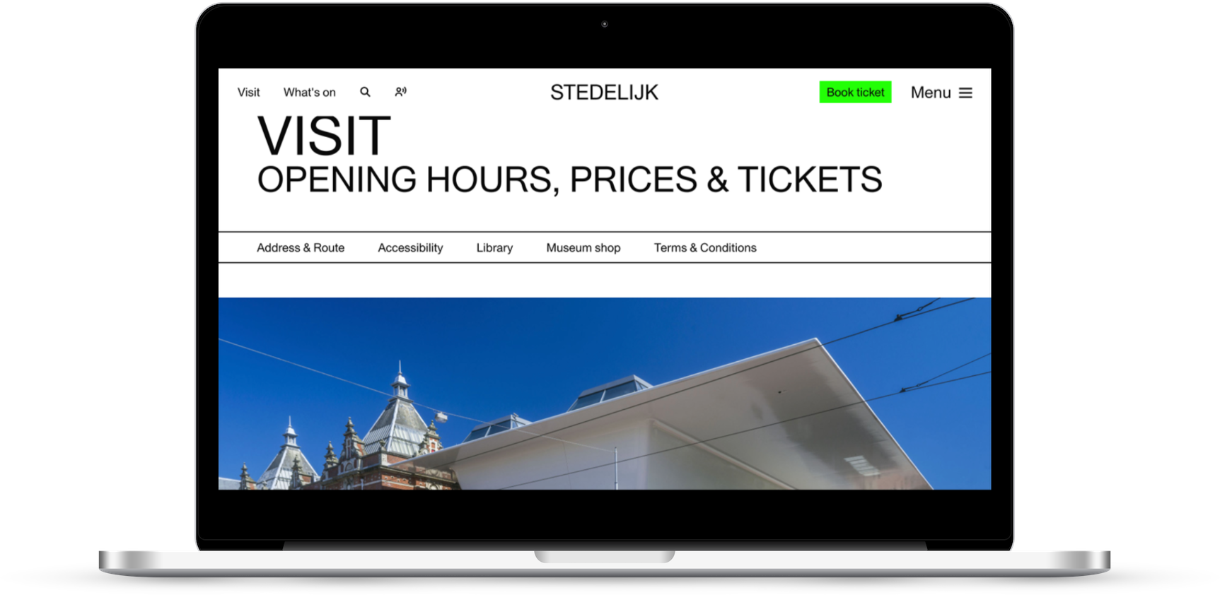
Nav simplicity
I will keep celebrating this wherever and whenever I see it.
Clear, simple navigation main options that provide the answers to the reasons most people are on your site are to be applauded.
Also the pop of colour on the book tickets button is effective given the monochrome nature of the rest of the design.
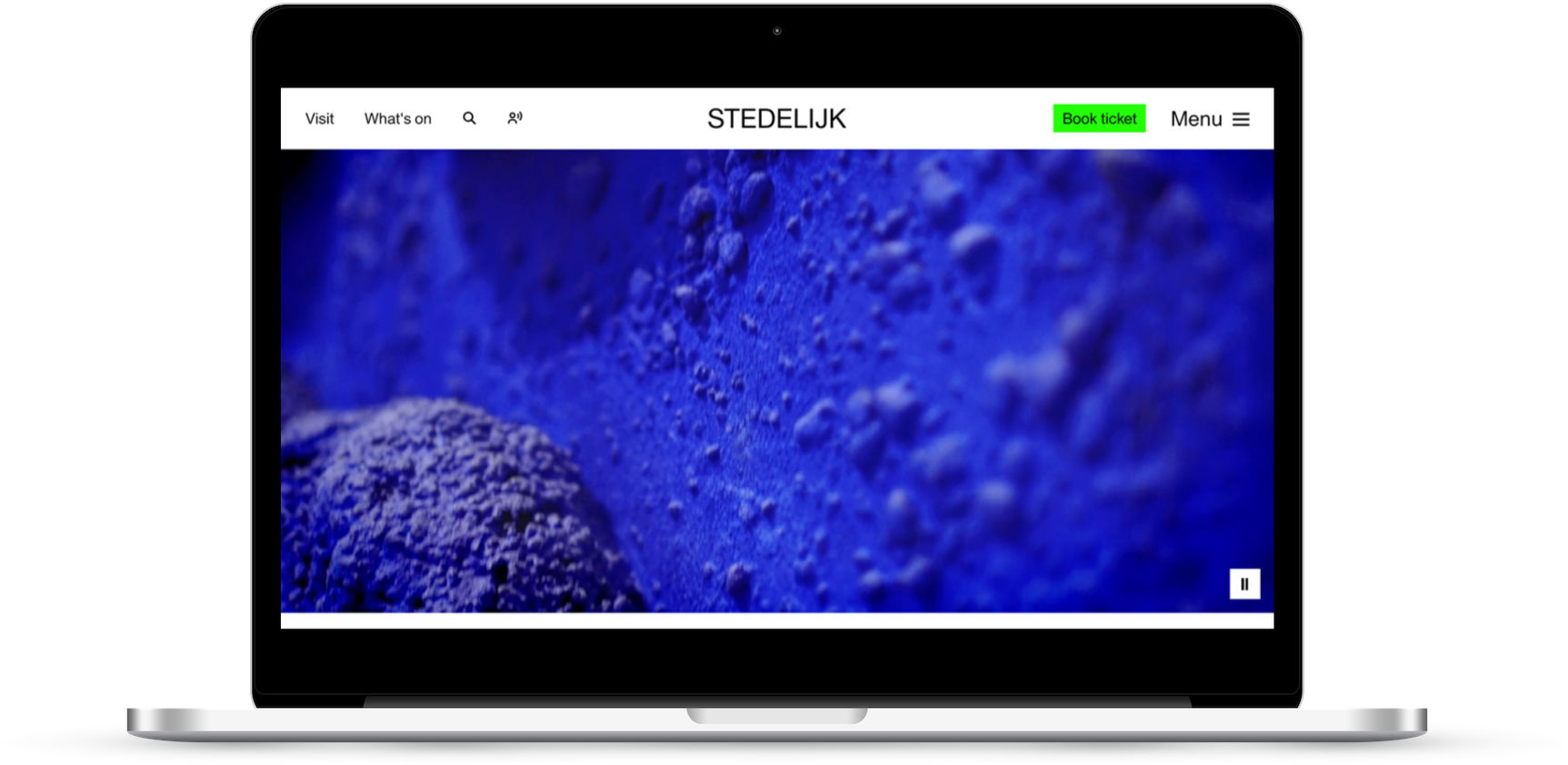
Video mastheads on exhibition pages
They have deployed high-impact videos in the ‘hero’ masthead position on the exhibition pages.
It’s a good example of ‘show don’t tell’ and sidesteps the difficulty that many visual arts organisations grapple with around a) trying to choose one artwork that represents the whole exhibition and b) often not being able to crop or resize images of artworks.
Typeface
I think the typeface choice is really strong and effective and works nicely in header and body text applications.
What I am less keen on
Misjudged design choices
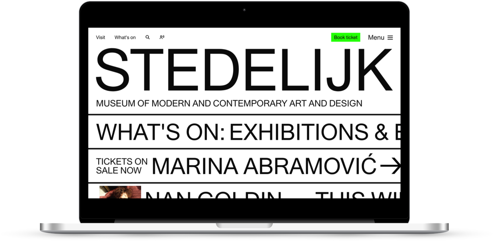
Much like a badly seasoned meal, they’ve overdone it with the salt.
The salt in question here being the typography-led approach to design.
This monochrome, horizontal, all-type, very-few-images approach comes from a similar trend to the one I saw on the sites for M+ and The Shed.
Used judiciously, it can be effective, but the application here is totally over the top and renders large swathes of the site very difficult to use.
It makes it difficult for users to scan the page and ‘flattens out’ much of the visual hierarchy (i.e. you’re not sure where you should be looking, what’s important and what’s purely decorative).
It’s a shame because used more thoughtfully I think this could be a very effective approach.
Added to this is the seemingly random application of marquee elements (horizontally scrolling sections of text) and it all just feels overwhelming and a bit annoying.
The ALL CAPS doesn’t help with this.
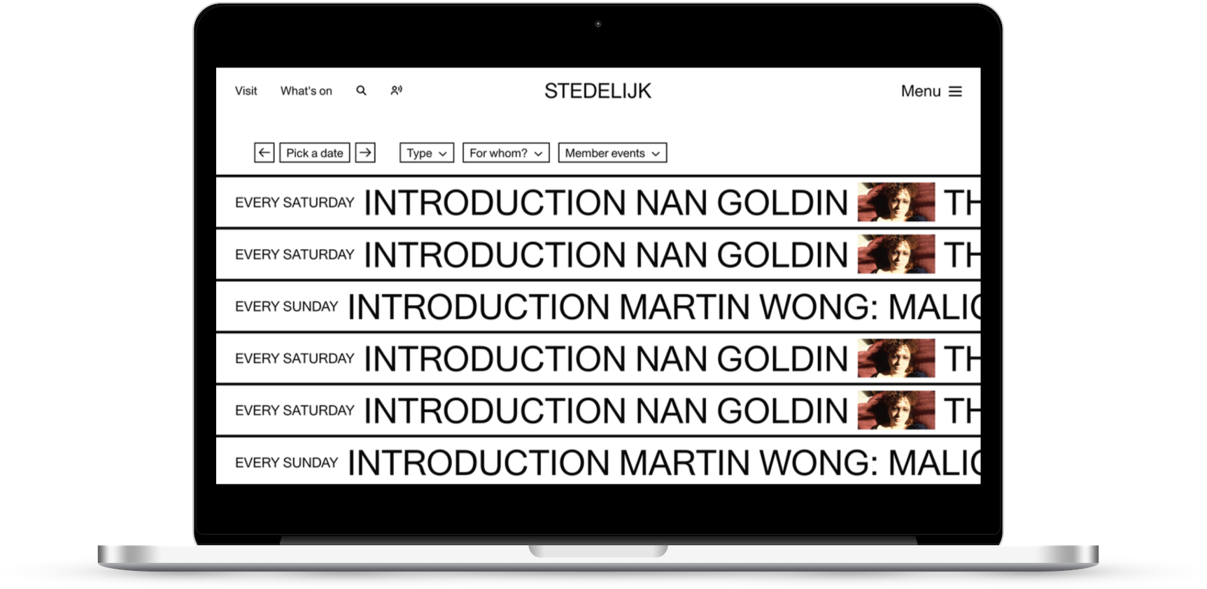
Tell don’t show
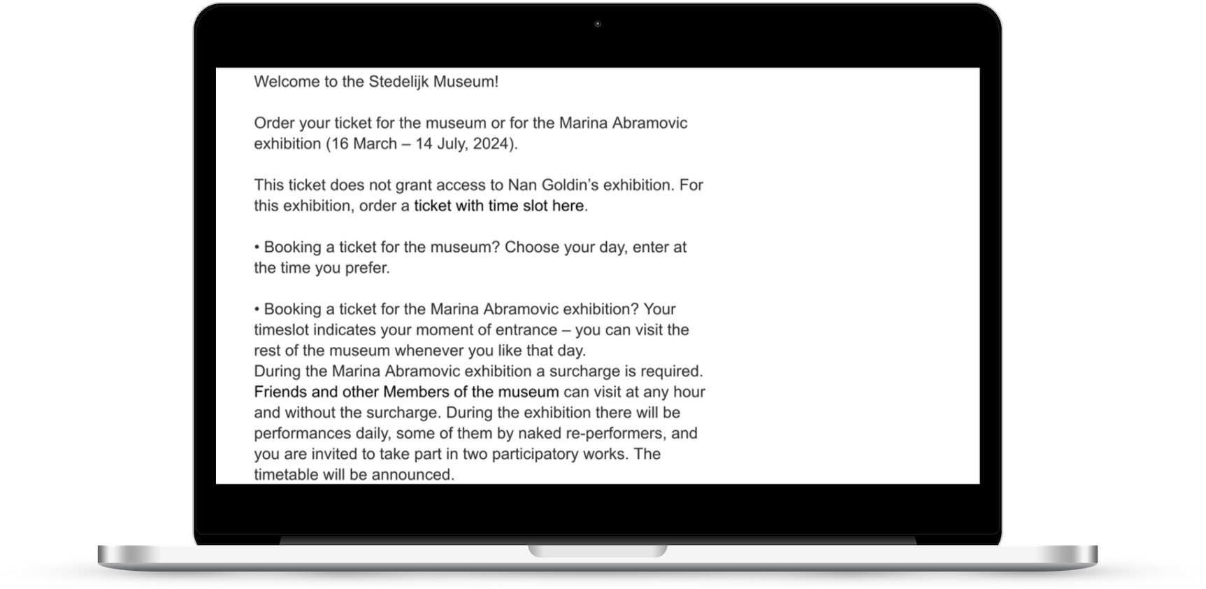
There are also issues with how they have approached the experience when it comes to booking tickets.
Clearly when I looked at the site they are promoting a Marina Abramović exhibition which has slightly fiddly ticketing constraints, but the way they lead the user through that is….well let’s just say I can’t imagine many people are reading all (or even some) of this.
Presentation of long-form content
There seems to be little content design expertise behind the way the long-form editorial content is presented on the site (it lives in the Dig Deeper section).
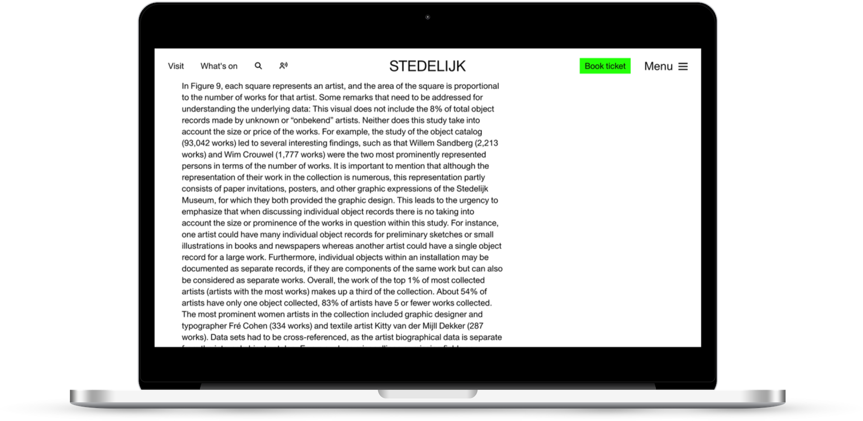
Overwhelming ‘walls’ of text, images just dumped on the page, it’s a real slog to try and engage with this content.
Tl;dr
- There is a clear, stripped-back approach to the main site nav
- The use of video mastheads on exhibition pages is nicely done
- The overall design approach to the site doesn’t feel successful, it seems that a design concept has been applied regardless of its suitability, or with any thought given to the overall user experience.
- This ‘sledgehammer’ approach extends to key commercial journeys (such as booking tickets) and engagement-focused ones too. There is so.much.text. Everywhere.
It’s a shame, because it is a genuinely brilliant gallery. But if the only experience/touchpoint I’d had was the website, I’m not sure I’d end up visiting.
I’d strongly recommend that The Stedelijk engage some content designers.
What do you think of The Stedelijk site? My opinion is just that, one opinion, I’m intrigued to hear yours.
Vote in the poll or leave your thoughts in the comments.