Cultural website, review of the week #005: The Wellcome Collection
Some thoughts about the approach the Wellcome Collection have taken to their site
Review of the week
Each week I’ll share an example cultural website, and some quick thoughts about what I reckon it does well, and less well, with a focus on a handful of key pages.
I’ll post screenshots of the pages I’m talking about. Although that is not really a very good way to showcase websites, so I’d recommend you go to each actual site and experience it for yourself.
I’ll also stick a poll at the end of each article, because polls are fun.
I have not been involved in the designing or building of any of these sites, so this is just my opinion as someone who spends (a lot of) time on these things both in my work and personal life. Equally this is not an ‘audit’, it’s just a collection of some first impressions.
The Wellcome Collection
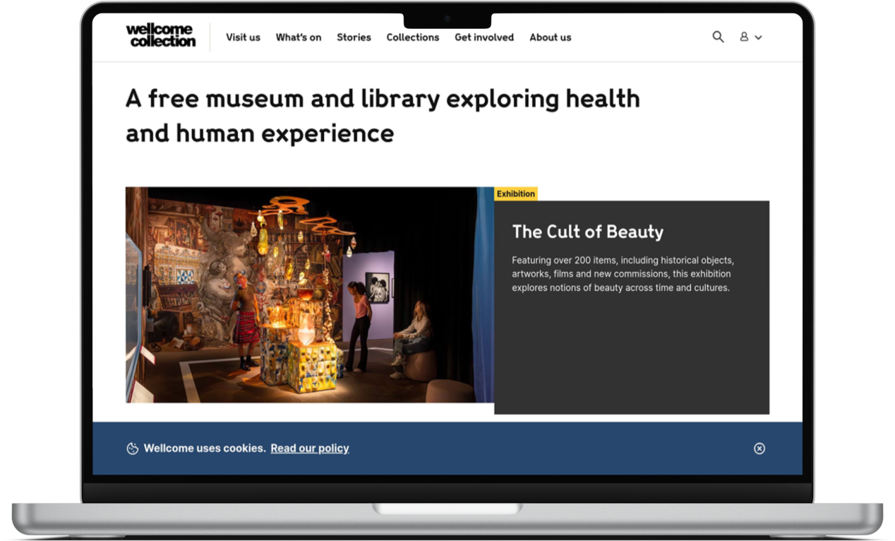
The Wellcome Collection is “a free museum and library exploring health and human experience”.
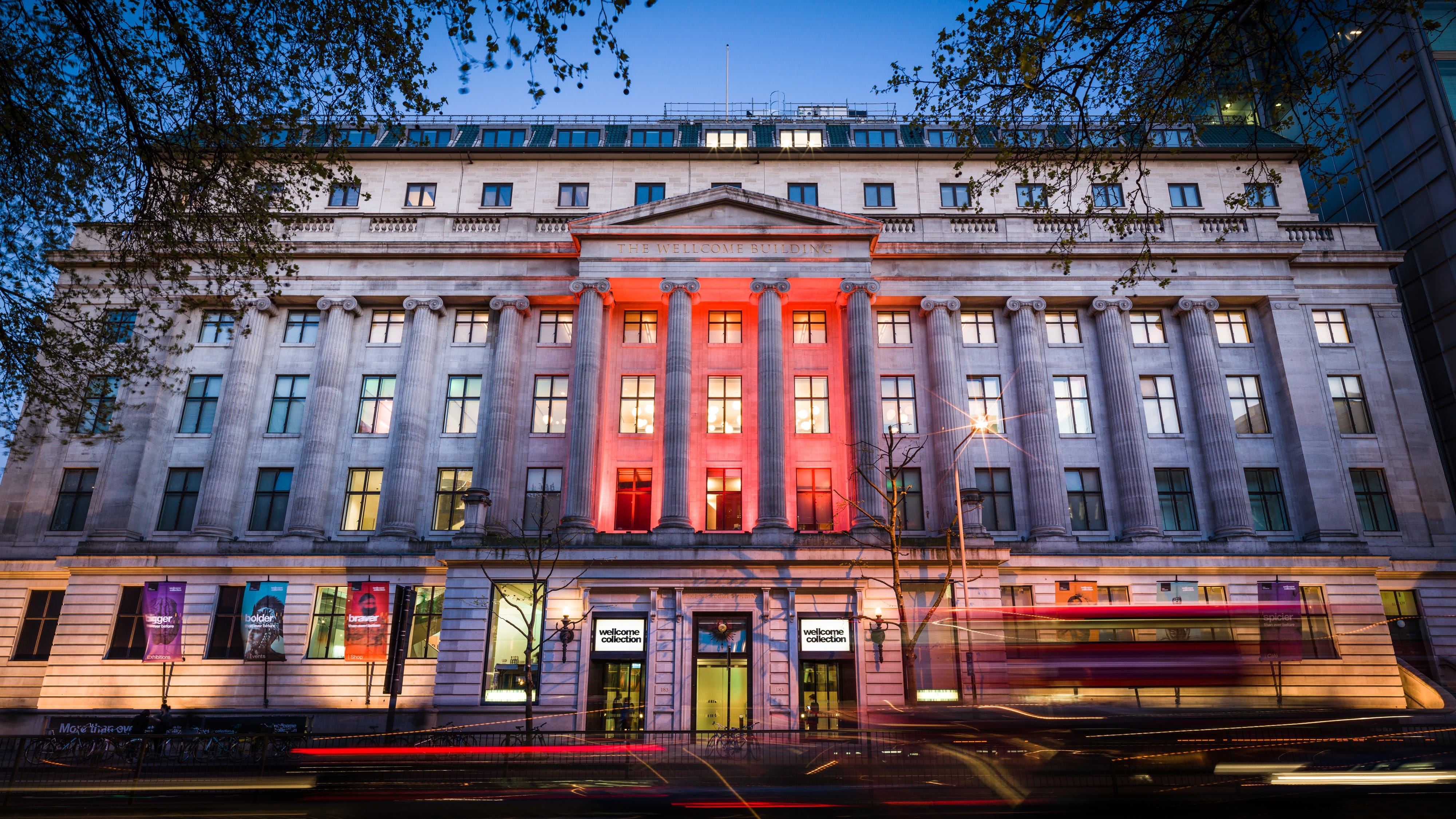
Its building is opposite Euston train station in London.
The Wellcome Collection has a good reputation as an organisation that is effective and ambitious in how it thinks about and executes its digital activity.
So, here are some thoughts about their website
What I like
Clear and to the point.
One of the first things users see when landing on the homepage is a short, clear explanation of what the Wellcome Collection actually is.
This is often something organisations forget to do, or actively avoid.
But the Wellcome sensibly doesn’t assume people arriving at the site will understand what the Wellcome Collection is or what it does.
Story-led approach to content
A few years ago now the Wellcome Collection won plaudits for its shift to a more editorial, story-led approach to its content.
It’s great to see that shift has not just endured, it has matured and evolved and the ‘Stories’ section of the site is full of interesting, informative, strange, and engaging articles, photo essays, publications, and comics.
Their approach to content is, I think, brilliant and something that more organisations should look to emulate.
They commission a really wide and diverse range of authors and artists to produce this content that ensures that it feels super-engaging, fresh, relevant and interesting.
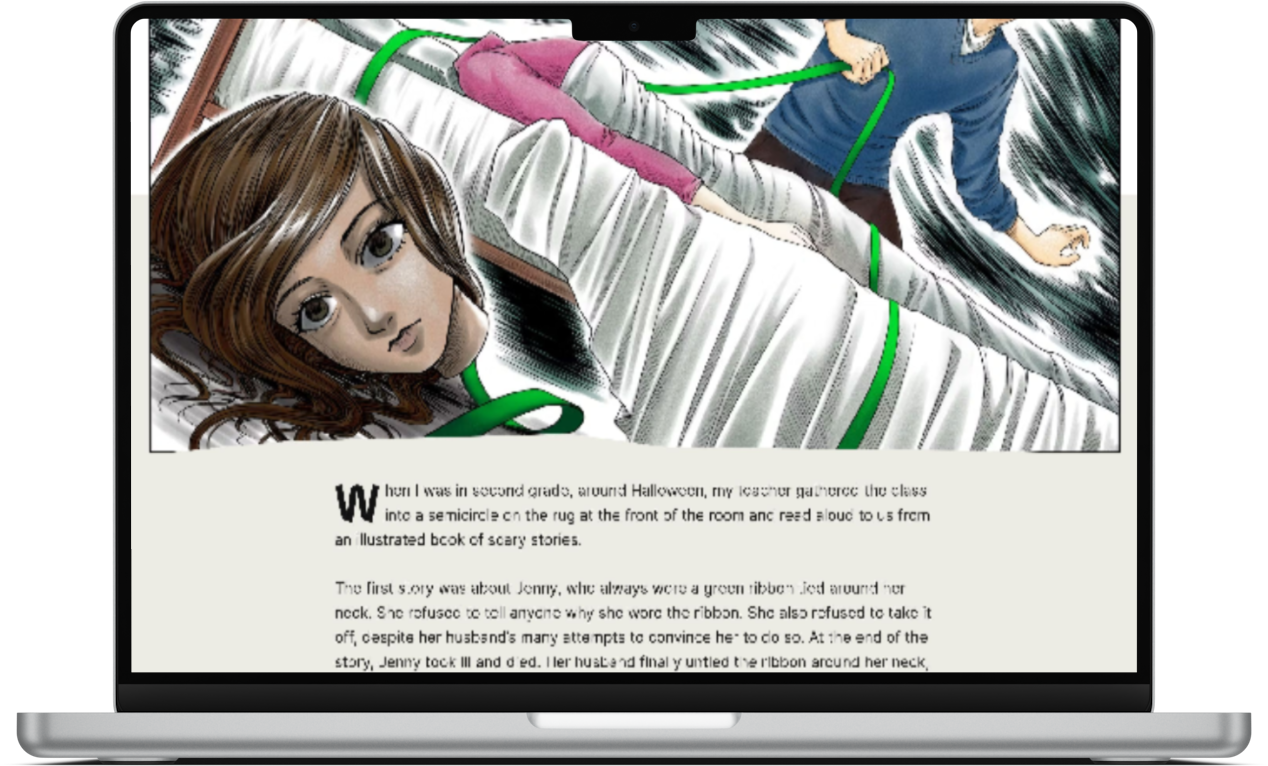
They have done a great job of producing content about health, science and human experience that doesn’t feel academic, dull, or insular.
What I’m less keen on
Overall approach to design
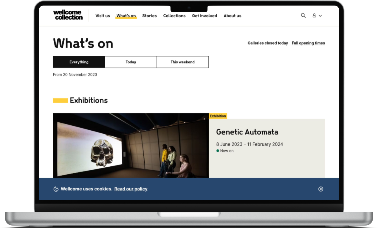
Whilst the site is unarguably clean and clear throughout, this cleanliness has - in my view - come at the cost of personality.
The design is extremely low-impact and similar throughout the site, there’s little to differentiate one page or section from another.
And that feels like a real shame because the tone and focus of the content I mention above is packed full of personality.
The calls to action are very low-key, and combined with the general approach to design the whole site feels like a very passive experience.
In some ways it’s a similar approach as the one taken to the Berliner Philharmoniker site, there’s nothing wrong or bad about the design per se, it just feels like a real missed opportunity.
Even a few small adjustments such as a bolder approach to typography, or the addition of some graphical devices would make a big improvement.
Who is the site for?
The Wellcome Collection is clearly trying to speak to a really diverse range of audiences, from academics to the general public.
And this means that there will be some very necessary parts of the site that will absolutely be for one audience but are not at all relevant for another (sections about research, or parts of the collection, etc).
However I’m not sure that the WC has cracked how to approach this structurally.
As a general user I felt like I ‘wandered’ into some very academic sections without meaning to which felt quite jarring and confusing.
It feels like there is probably quite a clear binary between ‘specialist’ and ‘generalist’ content/functionality and the site could perhaps do a better job of delineating between the two.
Overall
The site is admirably clear, ‘ego-free’, and obviously centred around the needs of users.
They have done a genuinely brilliant, engaging, and inspiring job with lots of their content.
However the approach to design feels a little disappointing (especially given how brilliant much of the content is) and at times the site doesn’t do a good or clear-enough job of “holding the user’s hand” to ensure they have the experience that’s most appropriate for them.
What do you think of the Wellcome Collection site? My opinion is just that, one opinion, I’m intrigued to hear yours.
Vote in the poll or leave your thoughts in the comments.