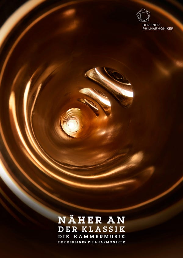
Cultural website, review of the week #002: Berliner Philharmoniker
Some (mildly despairing) thoughts on the website of one of the world's most renowned orchestras.
Review of the week
Each week I’ll share an example cultural website, and some quick thoughts about what I reckon it does well, and less well, with a focus on a handful of key pages.
I’ll post screenshots of the pages I’m talking about. Although that is not really a very good way to showcase websites, so I’d recommend you go to each actual site and experience it for yourself.
I’ll also stick a poll at the end of each article, because polls are fun.
I have not been involved in the designing or building of any of these sites, so this is just my opinion as someone who spends (a lot of) time on these things both in my work and personal life. Equally this is not an ‘audit’, it’s just a collection of some first impressions.
The Berlin Phil
On the whole, I find orchestral websites a bit of a weird world.
In my opinion they typically feel very staid, corporate and full of internal jargon.
Some (lots of) orchestral sites also feel really elitist, in so much as they appear to want to actively exclude people who are not fluent in how an orchestra works and performs.
But maybe I’m not the target market.
However I have fond memories of the Berliner Philharmoniker’s 2012 marketing campaign which felt intriguing and different.
So, does the website for the Berliner Philharmoniker also buck the trend?
It is worth flagging I’m commenting on the English language version of the website which is very similar, but not exactly the same, as the ‘main’ German language version of the site.
What I like:
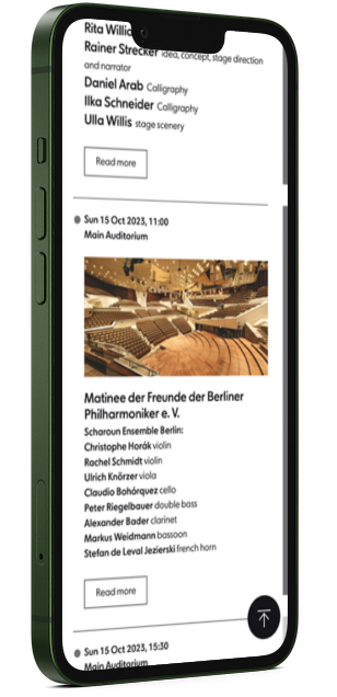
The timeline illustrating the orchestra’s history is neatly done. The interface for these types of solutions can often be a bit overwhelming but this is nicely laid out and intuitive to use.
At least it is on desktop, it’s a bit more messy on mobile.

But…
Ok, let me say, I really tried.
I really tried to find more noteworthy, exciting, or interesting elements.
I even shared the site with a colleague to see if others could find anything.
He liked the logo.
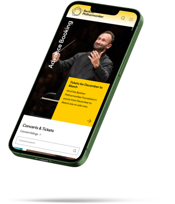
The site is competently put together, it works fine on mobile, it’s (mostly) clear. It’s almost certainly exactly what the orchestra wanted.
But it leaves me cold.
What I’m less keen on:
Maybe it’s an artform thing, or a brand thing, or a cultural context thing, but from my perspective I just don’t think the site has any personality.
I understand that there are stakeholders that need to be kept happy, and maybe the type of organisations that sponsor the Philharmoniker (e.g. Deutsche Bank), set clear expectations on this sort of thing.
Or maybe they just don’t have to try? I know friends of mine who have worked at famous orchestras in large cities in Germany and Austria always reported that it wasn’t especially difficult to attract audiences because of a) the huge numbers of tourists who come wanting to experience these famous orchestras, and b) the ‘classical music habit’ that already exists as a social norm in many of these places.
But really. Nothing about the content or design speaks to any sort of emotion, or experience.
There isn’t really anything inherently bad about this, if you had to describe it to someone you’d be describing a site that serves the needs of an orchestra.
But if this was one of the first touchpoints for someone who had never been to an orchestral concert, I’m not sure they’d want to buy a ticket or explore any further.
It feels like the website for a financial institution.
This feeling extends across every part of the site regardless of whether you’re looking at becoming a Friend, or reading about concerts for Families.
I really tried to find things that I really liked, that’s the whole point of this series - to find examples of good/interesting/cool stuff that people have done and to share it. But (timeline aside) I really couldn’t.
What do you think?
I didn’t expect to get flummoxed so early in this series (maybe this highlights that this format is doomed, but I’ll persevere for a while).
Am I missing something? What do you think of this site? Let me know in the comments or vote in the poll below.