Cultural website, review of the week #004: The Australian Ballet
Some thoughts on the website of one of Australia's leading cultural organisations
Review of the week
Each week I’ll share an example cultural website, and some quick thoughts about what I reckon it does well, and less well, with a focus on a handful of key pages.
I’ll post screenshots of the pages I’m talking about. Although that is not really a very good way to showcase websites, so I’d recommend you go to each actual site and experience it for yourself.
I’ll also stick a poll at the end of each article, because polls are fun.
I have not been involved in the designing or building of any of these sites, so this is just my opinion as someone who spends (a lot of) time on these things both in my work and personal life. Equally this is not an ‘audit’, it’s just a collection of some first impressions.
The Australian Ballet
About 5 years ago The Australian Ballet website used to be a regularly cited example when we spoke with new and existing clients about what they liked in cultural web design.
The Australian Ballet launched a new site recently, so I thought I’d take a look.
As an aside it’s interesting to consider the ‘raw assets’ that dance companies have in comparison to, say, orchestras when it comes to design use cases such as websites.
Images and video of dancers dancing are usually more objectively interesting and dynamic than those of orchestral musicians sat down playing their instruments. So there is a natural advantage there.
Let’s see how that translates…
What I liked:
High-impact homepage
They’ve gone for the obvious but effective ‘massive, impactful, beautiful homepage video’.
And it works.
It’s high impact, it’s beautiful, it looks luxurious.
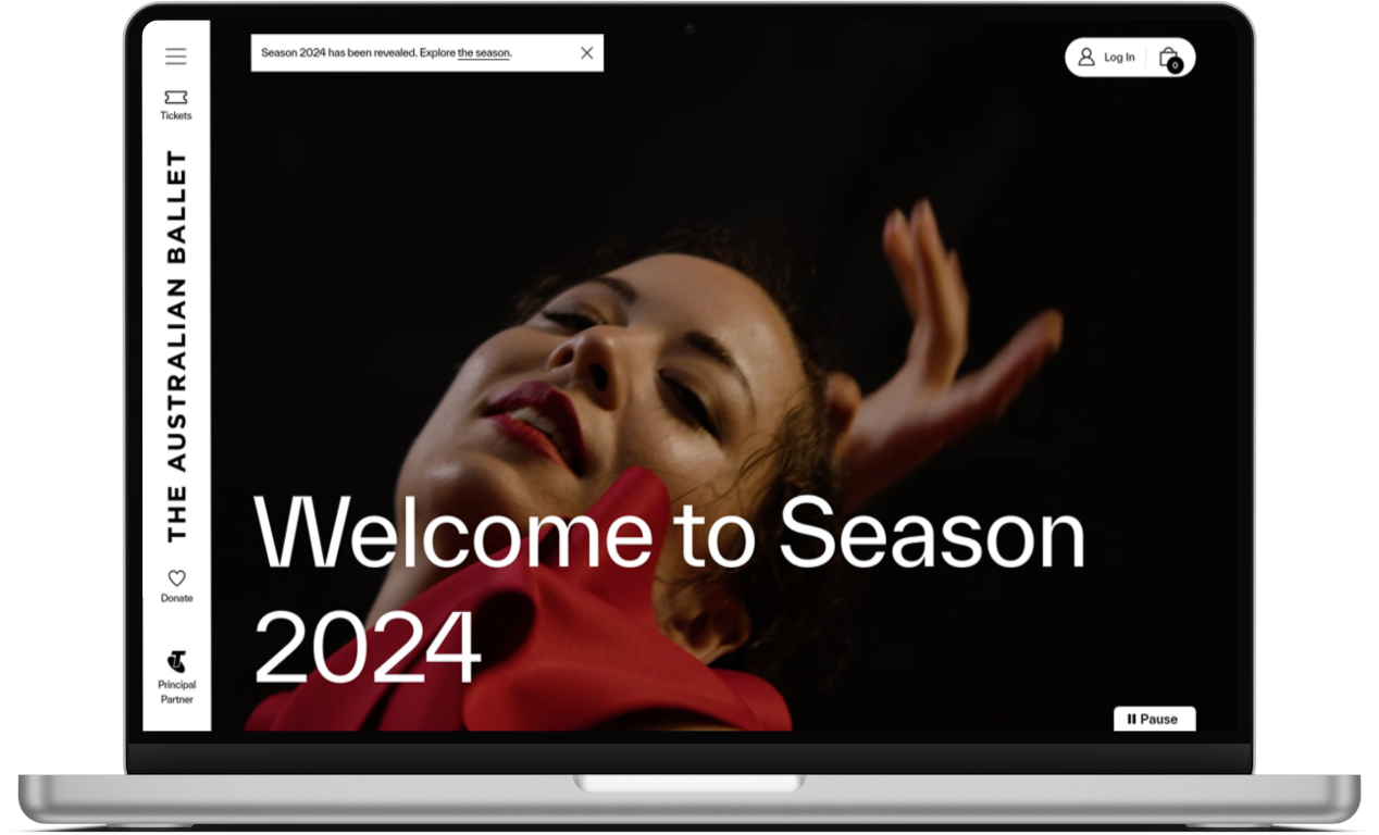
Although they lose points for the copy “welcome to season 2024” which doesn’t mean anything to a normal person, nor does it communicate anything useful (more on that below).
Collapsed navigation design
I’m a fan of the ‘sidebar’ navigation approach generally, and this looks clean and crisp.
It is also a practical choice as it leaves lots of real estate for the sort of high-impact media I mentioned above.
2024 Brand Film
It’s dynamic, it’s engaging.
It makes ballet look dramatic and beautiful and modern whilst also speaking to obvious heritage and history.
It focuses on music, and movement, and emotion.
Also it’s only 35 seconds long. Perfect!
Although I’m not sure the title ‘2024 Brand Film’ does it any favours.
What I’m less keen on:
Approach to language
I’ve mentioned a couple of examples above, but throughout the site there is quite a strange approach to language.
Quite often the language being used is almost meaningless (“welcome to season 2024”).
Or it is entirely focused on the organisation rather than the person reading it.
Here is some content from their Swan Lake show page:
“An enduring love story that has played a recurring role in the history of The Australian Ballet, the timeless Swan Lake is reinvented by Artistic Director David Hallberg in 2023. Inspired by Anne Woolliams’ 1977 production, this creation marks David Hallberg’s first major commission for the company as the centrepiece of the 60th anniversary celebrations.”
Everything here is focused on the organisation, or the creatives involved. “The history of The Australian Ballet”, “Artistic Director David Hallberg”, “Anne Woolliams”, “the company’s 60th anniversary celebrations”.
And this is from the lead paragraph promoting the show!
This is the opposite of being user-focused.
Referring back to the article I wrote last week on understanding why your audience are choosing to spend time and money with you, there seems to be little focus on that here.
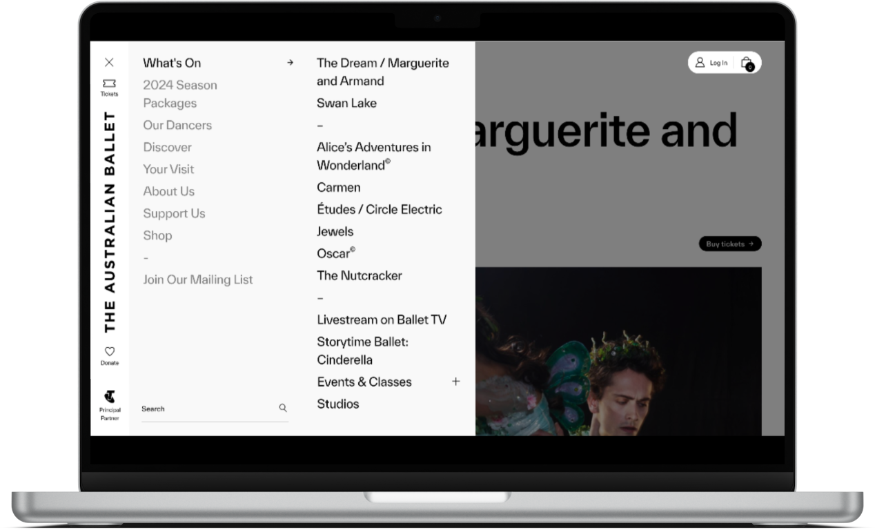
Navigation layout
I’m not a fan of the fact there is just a hamburger icon (the three, stacked, horizontal lines) to open the menu. All our usability testing shows that this still isn’t a widely understood device for many users, sticking the word ‘menu’ next to it usually helps resolve this.
Whilst the navigation looks clean when collapsed, when you open it it is incredibly overwhelming and confusing.
In the past editions of this series I’ve praised organisations that have presented a constrained, succinct set of navigation options to the user.
I have mentioned that cultural organisations often don’t respect the idea of cognitive load, and this is a perfect example.
“Just like computers, human brains have a limited amount of processing power. When the amount of information coming in exceeds our ability to handle it, our performance suffers. We may take longer to understand information, miss important details, or even get overwhelmed and abandon the task.”
In the screenshot below there are 28 navigation options being presented to the user at one time, with little or no hierarchy between them.
This is not creating a good, effective, or enjoyable experience for anyone.
Overall
This site is beautiful, there are some incredible images and pieces of video. The ‘hero’ font that is used in titles across the site is probably a custom typeface. Clearly a lot of money has been spent on it.
But as someone not fluent in ballet, or The Australian Ballet specifically, the approach to language and content feels confusing and exclusive.
Some really strange (and, in my view, poor) choices have been made about important aspects of the user experience, such as the navigation.
Overall this site feels like it has been made for The Australian Ballet, and a small group of ‘in the know’ supporters.
And maybe it has, as I say up the top, I’m not involved in making any of these sites.
But this site doesn’t feel especially engaging, welcoming, or useful for anyone who might be thinking about going to the ballet for the first time.
Some final thoughts:
- Dance-based organisations have an inherent advantage when it comes to image- and video-based content, use it!
- Cognitive load is important. Your users are time-poor, easily distracted, and don’t understand how your organisation works or is structured. Respect that in your design and navigation choices.
- Understand what your audience values, or needs, and lead with that in your content.
- Focusing on readability is not dumbing down
What do you think of The Australian Ballet site? My opinion is just that, one opinion, I’m intrigued to hear yours.
Vote in the poll or leave your thoughts in the comments.