Cultural website, review of the week: #007 Munch Museet
A few thoughts about the website for Oslo's (relatively) new Munch museum
Review of the week
Each week (although at the moment it’s more like every two weeks) I’ll share an example cultural website, and some quick thoughts about what I reckon it does well, and less well, with a focus on a handful of key pages.
I’ll post screenshots of the pages I’m talking about. Although that is not really a very good way to showcase websites, so I’d recommend you go to each actual site and experience it for yourself.
I’ll also stick a poll at the end of each article, because polls are fun.
I have not been involved in the designing or building of any of these sites, so this is just my opinion as someone who spends (a lot of) time on these things both in my work and personal life. Equally this is not an ‘audit’, it’s just a collection of some first impressions.
Explore 13 Floors Of Art
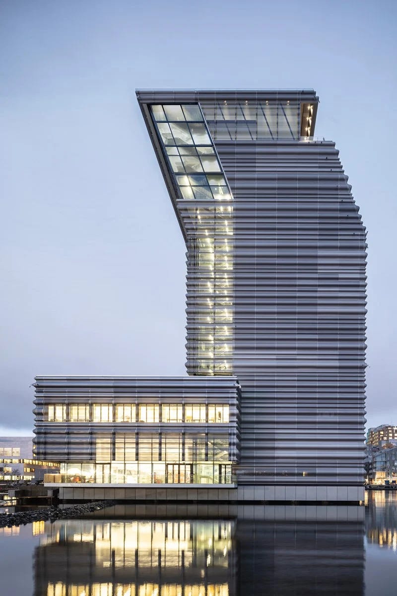
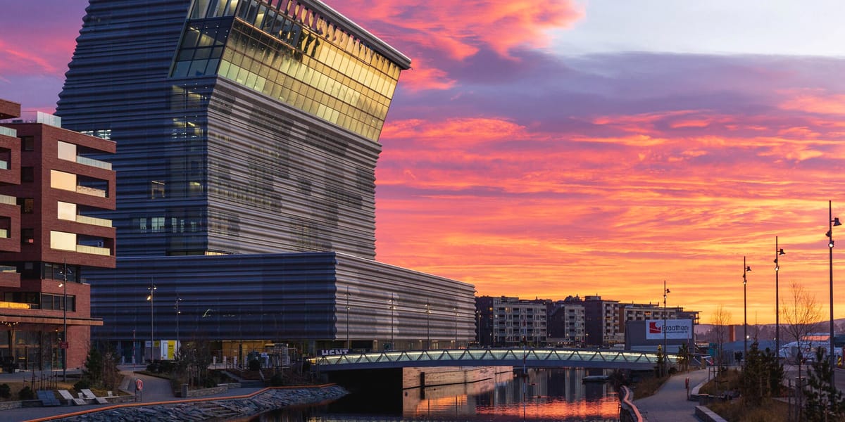
I went to the old Munch Museum about 20 years ago (shortly before The Scream was stolen that time - nothing to do with me, honest), and I followed the opening of the new (enormous) waterfront building, in 2021, with some interest.
“From a 1950s building in Tøyen to a modern museum by Oslo’s waterfront: MUNCH opened 22 October 2021, tailor-made for great art experiences. The unique legacy of Edvard Munch finally has the place it deserves.”
It’s always interesting to look at the websites for new places (whether that’s an existing organisation moving into a new building, a big building redevelopment, or an entirely new organisation), and I’ve been involved in a few projects like this.
In this context the website has an outsized job to do in relation to brand, in terms of establishing this new place in the minds and expectations of your potential audience.
It can also be a difficult assignment, as everyone is perhaps working off slightly different versions of what they think, or imagine, the new building/organisation will be.
So, how does the website for a brand new, 13-storey museum building “tailor-made for great art experiences” work?
What I liked
It doesn’t (immedialtely) look like a museum website
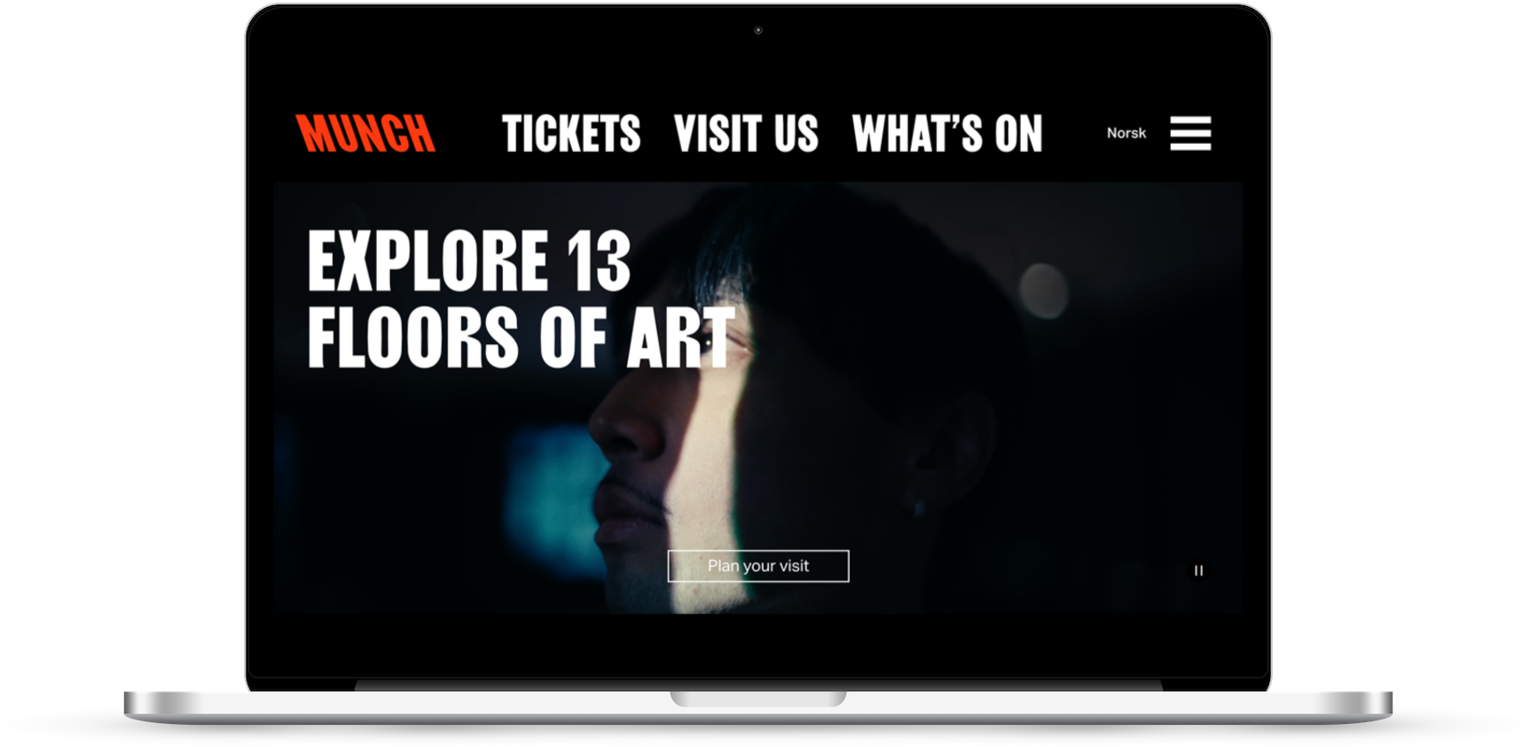
I’ve moaned before that all too often the start and end point for design thinking for the websites of cultural organisations always seems to be other cultural organisations.
And whilst there is merit in not totally reinventing the wheel (particularly when it comes to navigation, IA, and perhaps language), it does seem to lead to a lot of very boring choices being made.
The homogeneity (particularly in England and America) of cultural websites has long been a point of faint despair to me.
Which is why it’s good to see that the folks at the Munch Museet have taken a (slightly) different approach here.
Particularly with the application of the brand.
Is it successful?
Almost immediately not (more on that below). But there have to be points awarded for effort.
It falls into a more conventional approach the deeper into the site you go, but there is obviously an attempt at some different/fresh thinking here.
Main navigation
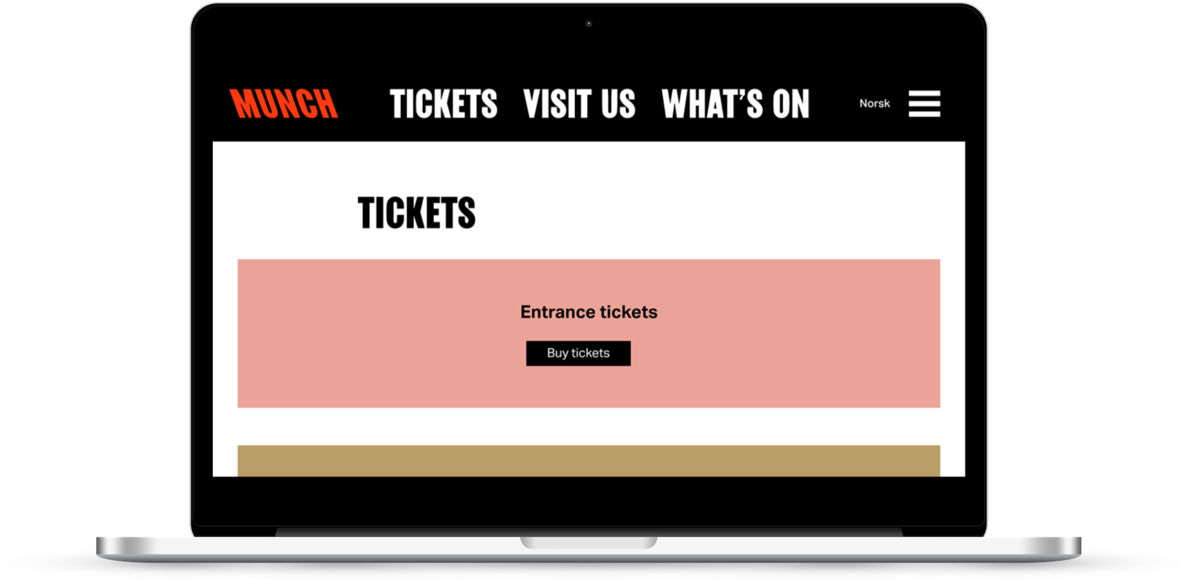
Munch, Tickets, Visit us, What’s on.
Simple. Clear. Bold.
Let’s ignore the secondary navigation (hidden behind an unlabelled burger icon) for now.
But they nailed it with the main nav.
Visit us content
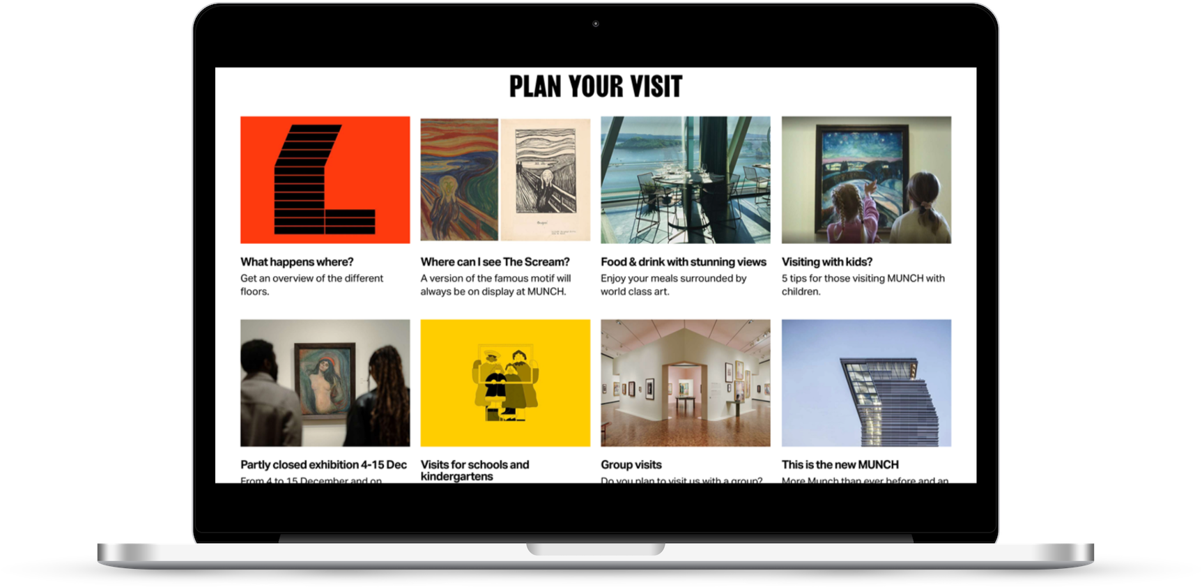
“Where can I see The Scream?”, “What happens where?”, “Visiting with kids?”, “Food and drink with stunning views”.
This is a nice way of framing the content curated for what I imagine are the questions that visitors most frequently ask, and the promotion of a food and drink offer in a way that is actually tempting.
Nothing groundbreaking here, but the ways into these content sections are nicely done.
When you get to it, the content itself is more of a mixed bag but there is still some good stuff in there.
What I’m less keen on
The visual identity, and page layouts
I’m not a designer, but I don’t like this brand.
Specifically I don’t like the typography, I’m not that keen on the colour scheme but it’s the typography that I really struggle with.
Blocky, all caps, difficult to scan, it feels like this site is shouting at me. All. The. Time. (which is a familiar feeling given the last site I wrote about was The Shed).
The overall design and layout of the site is also quite poorly executed, it feels like a jumble of disconnected elements.
Compare this, for example, to the coherence and fludity you experience when using the M+ website - which I wrote about in a previous review - even if you don’t like the M+ site, it immediately feels like a coherent experience.
The secondary navigation
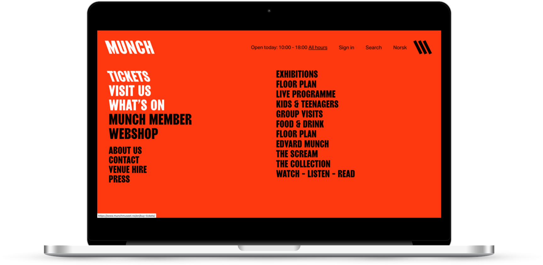
Holy bulging carpet, Batman.
I always say that a navigation menu like this (see also: footers with loads of links) is an indication of a load of lost arguments (another example: the silly scrolling menu on the M+ site).
With the nav menu open, there are 25 possible things for the user to engage with.
That is too many things.
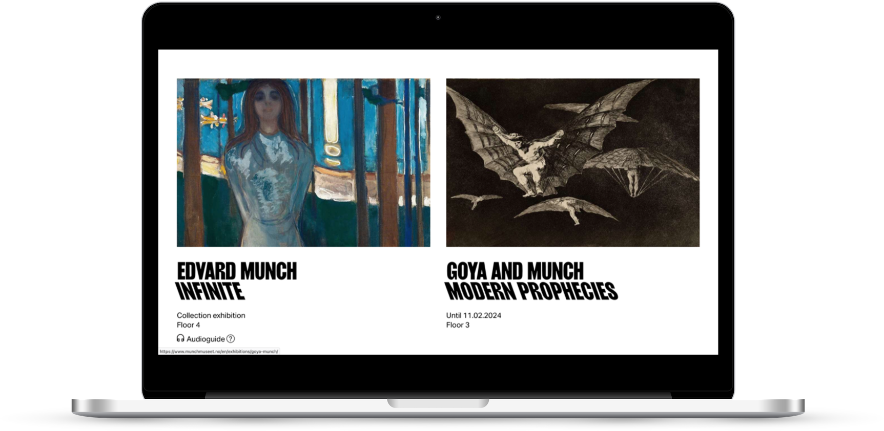
Exhibition pages
This is becoming a reoccuring theme (see also: National Portrait Gallery), but these exhibition pages are really not great.
They start off ok, but then they all suffer from the same disjointed approach I touched on above, and the content design is really lacklustre.
The pages for exhibitions based on the collection are more successful than the pages for temporary exhibitions, but not by much.
In terms of promoting and explaining the exhibition, wrapping in related content and events, and highlighting key works/objects, here are some (better, or more interesting) examples of this sort of approach:
- the V&A is one of the standard-setters for this type of page in my opinion
- proof you don’t have to be a massive, global cultural brand to get it right in this example from Pallant House Gallery
- a sleek, modern example from Foam in Amsterdam
What unites them is that all of these examples feel clear and coherent, whereas many of the exhibition pages on the Munch Museet site feel disconnected and messy.
Tl;dr
- The Munch Museet should be applauded for trying something a bit different, but there are lots of improvements that could be made.
- There are lots of parts of the site that are clear, clean, and strong, but then there are some really important aspects that are unsuccessful (including exhibition pages), or just a mess (that nav menu).
- This brand simply (IMO) doesn’t work in the way it’s applied here, it makes the website feel hostile and difficult to use.
- There are a few examples of good content thinking, for example some of the content about The Scream - well designed, well produced, well articulated - but they aren’t as regular or consistent as you’d expect.
What do you think of the Munch Museet site? My opinion is just that, one opinion, I’m intrigued to hear yours.
Vote in the poll or leave your thoughts in the comments.